How To Utilize Microsoft Word’s Business Plan Template

Microsoft Business Plan Template

Creating a comprehensive business plan is an important step for any blossoming business. Whether you’re hoping to attract new investors or qualify for a bank loan, you’ll likely need to present a documented plan to help clarify the ins and outs of your business for interested parties.

In a bid to woo the business crowd, Microsoft Word has developed a way to make the process of compiling a business proposal easier than ever. Microsoft Office offers more than a dozen business and marketing plan templates to help you create a coordinated, professional looking business plan with the potential to impress investors and other stakeholders.

If you’re using an older version of Word, you may need to visit the Microsoft website and download your business plan template from there.

But before you can begin compiling your business plan, you’ll need to sort out three important details about your business:

  1. What are your expenses?
  2. Do you have enough start-up capital?
  3. What are your sales projections during your first year?

Answering these can be one of the most difficult parts of writing a business plan, but doing so is necessary to ensure your business has the potential to sustain itself. Determining a clear, concise game plan for how your business will be run can set the tone for success early on.

Every business is unique with regard to tone and style. Because of this, the program comes equipped with a variety of templates to choose from. Once you’ve got a clear picture of what your business is, where it is and where you’d like it to go, you can then begin to develop a solid strategy to help your plans come to fruition.

Choose A Template

First, you’ll need to begin a new Word document. You can use the suggested search options to find your desired template. The template will contain step-by-step instructions to help you build your plan.

While all business plans are unique in their content, they should still follow the same formula in order to cover all the bases of your business.

An effective business plan will contain key highlights such as your business concept, market summary, competition, goals, opportunities, financial plans and others.

Compile An Executive Summary

Every legitimate business plan will contain an executive summary that paints a clear picture of your business. This will contain the “meat and potatoes” of your idea, meaning it’s where you will offer details about what you do, your goals, your mission statement and how you plan to become a success. This is likely the first section your potential investors will see, and therefore, it’s important to invest time in accurately capturing your idea so you can organize it properly.

Describe Your Business

This is where you will begin to explain crucial details of your business. You’ll be asked to describe your company’s ownership, your location, products and services and hours of operation, among other things. Here you will also go in-depth about how you plan to carry out your goals, including listing your suppliers, services, manufacturing and financial management.

Lay Out Your Marketing

Marketing is an important aspect of any business, regardless of industry. It’s a topic all business owners must consider, and it can be of great use when included within a business plan. It can help determine how much of your funds should be allocated for attracting new business.

Just like rent, payroll and materials are all large factors for a new business, marketing is one area that requires due diligence. A thorough business plan may contain things like market analysis, reports on market segmentation, competition and pricing. These are all key to understanding how well your business will do within your industry.

Address Financials In The Appendix

The last section of your business plan will be the appendix. Your business plan’s appendix will contain further details about the finances surrounding your operations. You’ll need to list things like your start-up expenses, for instance. How much will it take to launch your business off the ground? Cash flow and income projections are also vital for your business plan, as are other items like balance sheets and sales forecasts. You may even include things like tax returns in this section.

Sharing Your Business Plan

Once you’re done, share the file with your team via OneDrive. This will ensure your team members are able to view and make edits as needed. With Microsoft, team members can even see each other’s changes in real time.

If you are using Microsoft Team for communication, you can create a file folder and share your business plan there. This allows for a focused discussion about changes that may be needed, even if part of your team is working remotely. It’s important to gather the insight of those who know your business best, which can help your plan convey the most significant aspects of your business.
Microsoft Business Plan Template

Owning a company is hard, and creating an all-inclusive business plan is one of the many difficult tasks business owners are faced with. Microsoft Word is only one of the many tools at your disposal to create a business plan that paves the way for success.


What’s new in Office 365 for October?

Office 365 Updates October

It looks like, in October, there’s a lot going on, with your Office 365 Home or Office 365 Personal subscriptions. We know some of you are reading this do subscribe to one of Office 365 consumer plans. It’s great news if you fit that description and you have more than one device at home. Check out the latest updates to Office 365.

What’s New For Office 365 Home or Personal Subscriptions?

Office 365 Home and 365 Personal subscriptions use to have device install limits. Office 365 Home limited subscribers to 10 devices in total, across five users, and Office 365 Personal, limited subscribers to one PC or Mac and one tablet.

As of October 2nd, subscribers are permitted to install Office on an unlimited number of devices. And can be signed into their accounts on up to five of those devices at the same time.

And, for those with more prominent families, Microsoft increased the number of licenses in a Home subscription from five to six, with no change in price. To be clear, that’s six people with their Office license and 1 TB of OneDrive cloud storage each, for a total of 6 TB.

What’s The News About OneDrive Files On-Demand for Mac?

Microsoft announced at Ignite 2018 a preview for an enhancement to OneDrive called Files On-Demand. That enhancement has been available on Windows for a few months. For Mac, Files On-Demand makes it easy to have access to all your files. But only have the data you need to be stored locally on the device, thereby reducing the amount of local storage space consumed.

The way you work doesn’t need to change. That’s because in Finder all your files are accessible, allowing you to work as you do with other data on your device. Files On-Demand is available to consumer and commercial OneDrive customers, and works across all your personal, work, and shared folders in Office 365.

Status icons in Finder, make it easy to know whether your files are locally available or online. You can easily create files or folders always available, even when you don’t have an Internet connection, by right-clicking and selecting Always keep on this device.

Files On-Demand for Mac is currently available for Office Insiders on macOS Mojave. It gets enabled by running a simple script.

What’s The Latest Information On Super Zoom?

The new Super Zoom feature enables OneDrive on iOS users to use a pinch gesture. With the pinch gesture, you zoom in and out of the Photos view. Zoom out to easily scroll many photos at a time or zoom in to get a more extensive preview of your pictures as you browse. This feature gets supported on both OneDrive for Business as well as consumer accounts on iOS.

For those of you using OneDrive on Android devices, Super Zoom is already available, but only for OneDrive consumer accounts and should be coming to OneDrive for commercial accounts later this year.

Did Word & PowerPoint Get @mention To Tag Someone For Feedback?

When you use what is commonly known as the “at” sign with someone’s name in social media apps like Twitter or Facebook, the person you mention receives a notification about that post or comment.

Now you can use @mentions in Word and PowerPoint to draw someone’s attention to comments in a document or presentation when you’re collaborating. Just add the @ sign, then type the name, of and the person from your organization; who are working with you.

That particular person receives an email, with a link directly to your comment. Clicking the link brings them into the document or presentation and the conversation. Using @mentions in Office can help take the lag time out of the collaboration process helping you get more work done, faster.

Outlook Has a New User Experience Designed For Simplicity

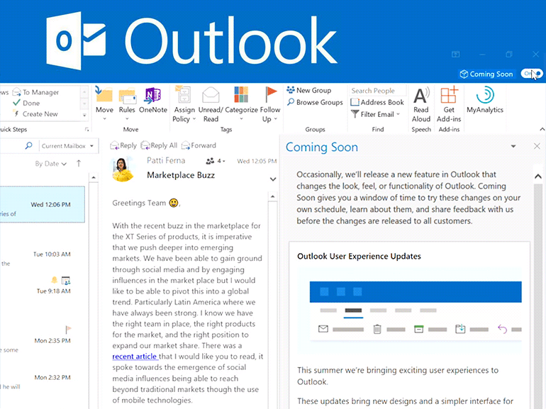
The latest updates to Outlook for Windows is the “Coming Soon” feature. That new functionality getting introduced to Outlook for Windows gives Office insiders a window of time to try new features on their schedule before they are released more broadly.

One of the new features being showcased using the new Coming Soon features pane are the new Simplified Ribbon. It lets you focus on the core of what you need, displaying a single row of commands versus the three lines of powers in the classic ribbon.

It is still easily expandable, so you’re always in control. The default set of commands in the simplified ribbon are those used most frequently, and less commonly used commands are always still available with just a click or two. In addition to the Simplified Ribbon, Microsoft made updates across the entire mail and calendar experience to improve productivity and keep you more organized.

What Got Added To The Power BI Built-in Report Theme Options?

Most Office users are familiar with applying themes in Word, Excel, and PowerPoint to give your content a consistent set of fonts, colors, and effects. The Power BI team recently added the option to apply new built-in themes to Power BI reports, similar to what you can do with Word, Excel, and PowerPoint. You’ll see these more modern theme options by selecting “Switch Theme” in the Home ribbon in Power BI Desktop.

What you’ll need to do is pick your desired theme from one of seven new options, and it does apply it to all your visuals that use the default color palette. You can also find a link to the report theme gallery in the same place which contains additional community-developed themes.

This update also includes a preview of a PDF file connector that lets you access table data in PDF files, a preview of IntelliSense support for the M language used by Power BI, and a lot more.

What Is The New SharePoint File Template Management?

SharePoint has been at the heart of document-centric collaboration since long before Office 365 existed. SharePoint content types are essential to Microsoft’s vision of how they will continue to deliver content services innovation in Office 365 and by extension, Microsoft 365.

Now you can add document templates to SharePoint document library content types.  Microsoft also added the ability to edit the New menu – to add, hide or reorder the new file options.

With this new capability, you can maintain the default templates for things like Word, Excel, and PowerPoint along with any newly added templates and content types specific to your requirements. Configuring the New menu is easy. Select (or deselect) which templates you wish to see and by using drag and drop to re-order the templates in the list.

In the Office client, you can edit the template directly. You can change the template’s content type or delete the template. While scoped to a single document library, for now, Microsoft will expand these capabilities to allow you to distribute and publish content types, with associated templates and metadata definitions, to multiple site collections and libraries in a single transaction.

Office 365 Updates October

Did you find this article informative? If you liked this one, check out our other content we think you’ll find interesting.

10 Easy Steps Implementing Your Successful SOP with SharePoint

Sharepoint SOPs

Standard Operating Procedures (SOPs) are necessary for every industry. The written procedures keep a company on track. The importance of having them is to guarantee the organization remains compliant with all federally mandated regulations, legislation, and ever-changing laws. But too often many businesses will continue to struggle with getting the correct and appropriate SOP created, distributed and understood by their employees.

Sharepoint SOPs

What is an SOP?

Standard Operating Procedures are clearly defined instructions. Their purpose is to, execute consistency of the performance, of a specific function. A detailed written and enacted SOP are used to fulfill compliance requirements, mitigate safety and health risk, and directly work consistently and efficiently across an entire organization. This guide provides you with ten easy steps to review when implementing your organization’s SOP.

Step 1 – SOP purpose is clearly understood and explained

Are you wondering why an SOP is required? In your organization, you want problems solved before they arise. So, what issues need addressing and what does it need to accomplish. Here are some examples:

  • Reducing costs
  • Increasing quality
  • Ensuring safety
  • Reducing risk
  • Protecting the environment
  • Providing a training source

Step 2 – Consider your audience diversity

Before your Standard Operating Procedure gets written, you’ll want to look at your intended audience. Does this audience have prior knowledge of the subject matter? Will they have the necessary language skills to understand? Also, what is the size and shape of your audience? Remember, some parts of the SOP will make sense to one group, but not another.

Step 3 – Format and layout must be useful

There are no right or wrong ways when designing or presenting your SOP, but here are some easy reminders to consider:

  • If you have a pre-existing format that is working well, then there is no need to change it, but do consider slight enhancements. Sometimes a new visual does grab the readers attention.
  • Does your process have multiple routes? That’s okay. Consider using a flowchart layout. Many individuals learn better with visual content.
  • How long is the process? Short or very long? Then use hierarchical steps. To provide clarity, give a list of main steps with sub-steps underneath that helps.
  • Is the routine simple which only requires just a few steps? Then using a simple list may be the most beneficial way.

Step 4 – Suitable authors must be used

To write an SOP; you need to have the necessary knowledge. While you may have been assigned to create, and even own this SOP, always bear in mind, you need to have the required expertise to write it. Guarantee that experts in the relevant areas get brought into the authorizing process. Using SharePoint tools to expedite that collaboration is crucial to success during this phase.

Step 5 – Supply appropriate content and structure

There will always be specific needs for unique situations. But, these examples below are necessary details that must get included in your SOP:

  • What is the scope of an SOP
  • What is the SOP procedure
  • Are there any Health and Safety Considerations
  • Are there any equipment needs
  • Glossary of terms and Hints and Tips

Step 6 – Use a writing style the reader can easily read and understand

  • All content in your document must remain clear and easy to read. Not doing so will make it hard for your reader understand any references, making comprehension difficult.
  • Avoid personal pronouns, such as He, Him, She, Her, Them, and You.
  • Establish steps that explicitly help with ease of reference and maintenance in the future.
  • Avoid walls of text. Insert diagrams, flowcharts, and bullet points.

Step 7 – Mandatory SOP testing

Your personnel must get SOP tested, especially by the people who will use it, and guarantee comments are taken on board and updated within the SOP as needed and required.

Step 8 – Make it known to your entire staff where to find the SOP

Organizations that have implemented a Standard Operating Procedure, typically have a known location where to find the material. But do not assume everyone in your organization knows where to look. It might be at a SharePoint site either department or organization level, but make sure everyone knows where to look.

Step 9 – Check that the SOP was distributed and read

While a repository is required, placing your SOP on SharePoint to be read does not go far enough. Immediately after your SOP gets updated or put in place, an email should be crafted and sent to all the relevant user groups to read the document. Then a response back from all recipients they have read and understood the material. You could use a SharePoint based tool to manage this whole process for you.

Step 10 – Guarantee staff fully understands

After each staff member has read the SOP, next comes sitting with them to make sure they clearly understand and expected of them. There is a need to guarantee your team has a clear understanding of what is meant by the Standard Operating Procedure. Testing your staff after reading the material, gives you an idea of what they do or do not comprehend, and how you can address any concerns.

Did you find this article informative? If you liked this one, check out our other content we think you’ll find interesting.

What Are The New Changes in Microsoft Outlook?

https://i1.wp.com/www.archynety.com/wp-content/uploads/2018/09/Outlook-Microsoft-starts-with-the-implementation-of-its-simplified-custom-ribbon.png?w=770&ssl=1

New Calendar, Mail, and mobile Outlook features help you get things done, was the title of the April 30th, 2018 blog from Microsoft’s Outlook team, about the newest features. Since then, Outlook has received more modern additions, from mobile management to enterprise information protection all designed for user simplicity. So, let’s step inside and see what new changes Microsoft Outlook has.

What’s New Inside Outlook Calendar?

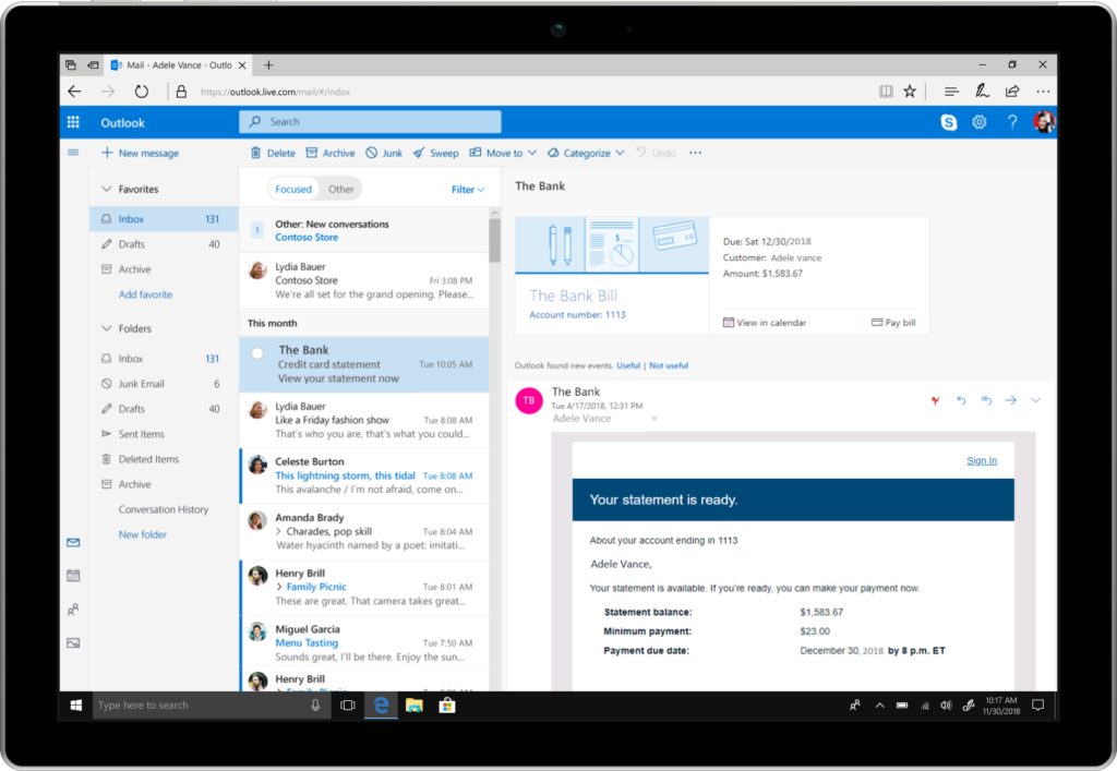
With the familiarity of Outlook and making it easier to get things done, and customizable, so you stay in control, it couldn’t be any simpler than Bill Pay Reminders. That’s correct, inside Calendar you can automatically track these events.

At the top of your email, you’ll get a summary card (See Fig 1.), just like you do when your package delivery information or any travel reservations is presented in Outlook at the top in your Email Today.

https://www.microsoft.com/en-us/microsoft-365/blog/wp-content/uploads/sites/2/2018/04/000000_OutlookOnline_BillPay_surface_m2-1024x707.png

Fig 1. Summary Card inside Microsoft Outlook

Outlook will identify the bills you receive in your email. At the top, it will show you a summary, and automatically add a calendar event on the due date. Two days before the due date, you’ll receive an email reminder so you won’t forget to pay your bills on time.

Suggested meeting rooms and event locations—Adding a meeting or event location just got faster and easier inside Outlook. Similar to a virtual assistant Outlook will offer suggestions for your meeting location. Just start typing in the location field. Based on Bing, Outlook suggests options and then autocompletes your meeting location with the information you’ll need.

Outlook’s rich location feature adds the full address for public locations into your calendar event. Based on your current location, your destination address, and traffic updates a notification is sent when it is time to leave.

Also reserving a meeting room, from your mobile device continues getting more accessible and faster as Outlook learns your preferences. Let’s say you must find a conference room. Outlook will show you what your organization’s room availability is so that you can choose what option is best for your meeting, and it’s all done with just a tap.

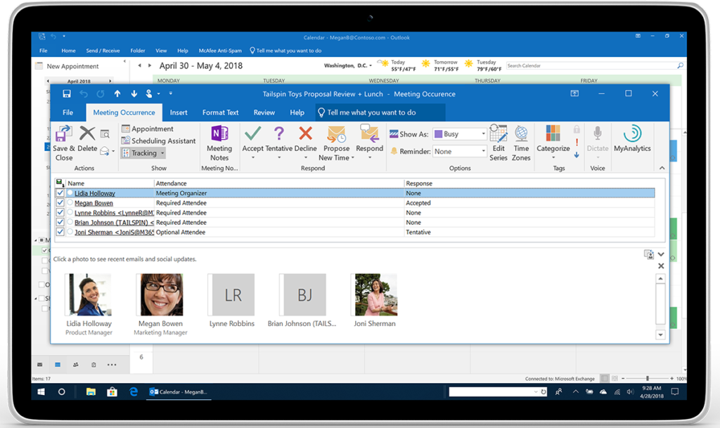
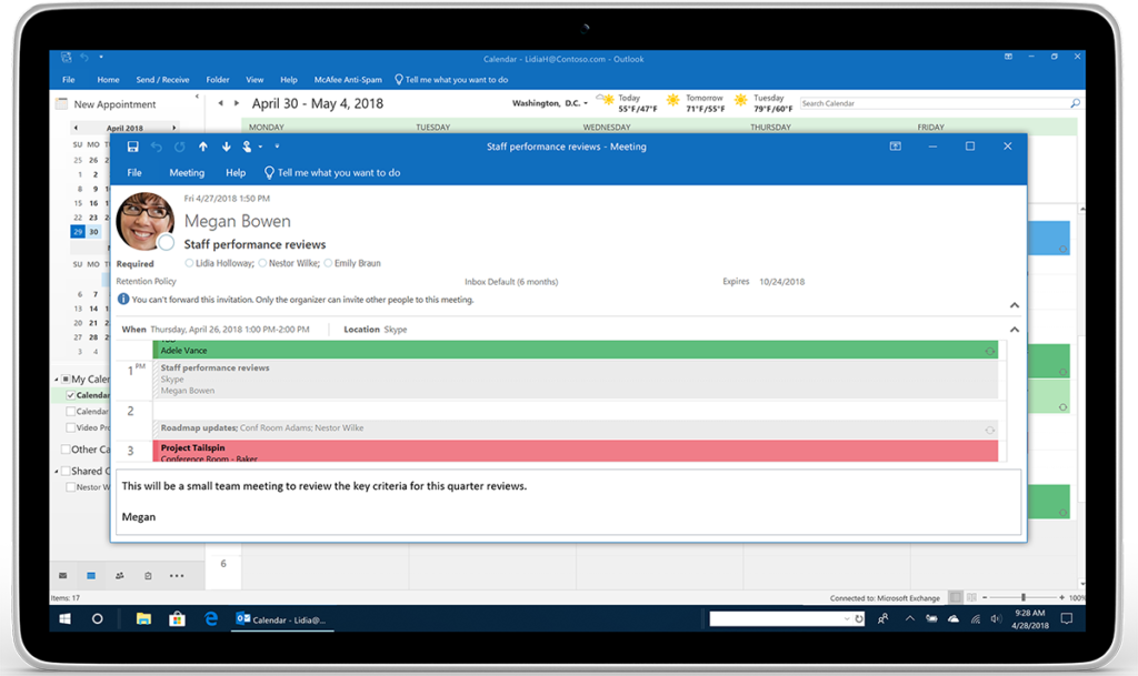
Meeting RSVP tracking and forwarding—The key to time management is keeping track of events you’ve plan to attend, or organized. However, managing who is participating is more useful to you also. Inside Outlook, you can now see all tracked meeting responses and RSVPs. (See Fig 2.)

https://www.microsoft.com/en-us/microsoft-365/blog/wp-content/uploads/sites/2/2018/04/Image-2-Outlook_Calendar-RSVP-Tracking_Tablet_m2-1024x609.png

Fig 2. Person’s Name, who are attending, and their responses are shown for easy tracking.

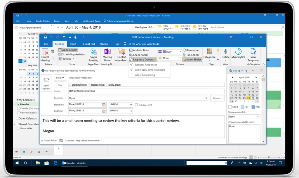
But let’s say you have to plan a meeting, and you are required to keep complete control of the attendees on the list. Inside Outlook, you have a new option to prevent or allow your calendar invitation from being forwarded without your knowledge. Under Response Options, click New Meeting and then check or uncheck Allow Forwarding. (See Fig 3.)

https://www.microsoft.com/en-us/microsoft-365/blog/wp-content/uploads/sites/2/2018/04/Image-3-_Outlook_Calendar-No-forwarding-Megan_Tablet_m1-1024x609.png

Fig 3. The Response Options’ drop-down menu shows where to check or uncheck.

https://www.microsoft.com/en-us/microsoft-365/blog/wp-content/uploads/sites/2/2018/04/Image-4-Outlook_Calendar-No-forwarding-Lidia_Tablet_m1-1024x609.png

Fig 4. Below recipient’s photo is a message alerting them, they cannot forward this invitation.

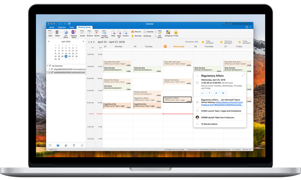
Multiple time zones—Managing events, inside Outlook, across various times zones, is no longer complicated. Go ahead and define the start and end times, across all time zones, for your meetings and appointments. Set up that travel event from the departing time zone to when you arrive at your final destination, in another time zone. (See Fig 5.)

https://www.microsoft.com/en-us/microsoft-365/blog/wp-content/uploads/sites/2/2018/04/Image-5-Outlook_DualTimeZone_Macbook-Pro-15_m1-1024x614.png

Fig 5. On the main calendar grid, you can display multiple time zones in Outlook.

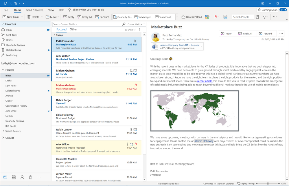
Simplified Ribbon— is adaptable and easily customizable. That single row of commands you rely on can be quickly and easily personalized. You can either pin the controls or remove them from the ribbon anytime. Should you want to go back to the classic, full-ribbon, just click back anytime. (See Fig 6.)

  • Simplified Ribbon is adaptive
  • Adjusts icon labels
  • Moves commands out of the way
  • Scales up or down to fit different window sizes
  • Accessible through new ellipses and menu drop down experiences.

https://gxcuf89792.i.lithium.com/t5/image/serverpage/image-id/44743i5D498FE0B9BA6688/image-size/large?v=1.0&px=999

Fig 6. Ribbon shows customized commands.

“Coming Soon”— in Outlook for Windows, the Outlook team introduced a new feature called “Coming soon.” Coming Soon is about making it easier for all users, to discover and learn more about significant updates. With this feature, you just turn it on or off. When it’s on, you can see upcoming visuals that are coming to Outlook. Your overall core experience is now cleaner, simpler and more modern. (See Fig 7.)

https://i1.wp.com/www.archynety.com/wp-content/uploads/2018/09/Outlook-Microsoft-starts-with-the-implementation-of-its-simplified-custom-ribbon.png?w=770&ssl=1

The updated Outlook for Windows experience is more straightforward and more customizable. You will work faster and get back to the things that matter most, your free time and user experience. Outlook helps you connect, organize and get things done.

[1] New Calendar, Mail, and mobile Outlook features help you get things done

[2] Your favorite email app, Outlook mobile, adds new enterprise information protection and mobile management capabilities

Did you find this article informative? If you liked this one, check out our other content we think you’ll find interesting.


5 Important Features You’ll Find In iOS12

ios 12 update

Apple’s newest software update has arrived, and it’s already making an impact in how effectively users manage their smartphones. iOS 12, which comes preinstalled in the iPhone XS and iPhone XS Max, is equipped with a number of shiny, new features sure to delight iPhone and iPad users, old and new models alike. From stronger battery performance to significant upgrades to maps, notifications and passwords, iOS 12 is robust in its delivery. Here, we’ll explore some of iOS12’s most anticipated new features, and how they can help you achieve more with your iPhone or iPad.

Battery Performance And Battery Life

Mobile phones are designed to help users achieve everyday tasks with ease. However, with this great power comes a need for great battery life. Luckily, iOS12 delivers on this front. The new update offers significant upgrades in both battery life and performance, helping you operate your device for longer and with more speed than ever before. What’s more, owners of older model iPhones are reaping the biggest benefits. In terms of the newest update, the older your iPhone model, the better. According to Apple, older models can expect to see speed boosts of up to 70% faster.

Earlier versions of iOS allowed users to see how much battery their favorite apps were using, and for how long. In efforts to help users further understand the extent of their usage, iOS 12 offers users charts that display battery use in great detail. The charts are broken down by Screen On usage and Screen Off Usage. Also, now users are able to see how fast their battery was depleted, as well as how these levels were during any part of the previous 24 hours. There is also a long-term overview to help users evaluate their usage over time.

Instant Tuning

An onslaught of notifications can be annoying and distracting. The new software update seeks to remedy the inconvenience of too many notifications. Now, ioS offers instant tuning, which means users can now edit notification settings on the notification itself. They can even set specific apps to deliver notifications silently, meaning they’ll show up on the display, but without vibrations or sound alerts.

Some other changes to notifications? The Do Not Disturb feature on your phone just got a whole lot more effective, allowing you to further manage the time frames in which you do not want disruptions. You can set your phone on Do Not Disturb for a certain time frame, for a certain location, or pretty much whatever time you choose.

Grouped Notifications

A common complaint among iPhone users is the barrage of notifications they receive on their screen after they’ve been inactive. Instead of receiving one notification for text messages, they were forced to scroll through endless notifications, which made it hard to easily locate priority alerts. Now, with grouped notifications, users will instead see one notification for each app, leaving more room for prioritizing tasks.

Redesigned Maps App

The modern day smartphone user relies heavily on map apps to help them reach their destinations. Glitches in the map apps are highly inconvenient for users, and the new iOS update helps to alleviate this. Other improvements include more detail like foliage, buildings, pools, pedestrian pathways and the ability to see into buildings. Currently, this feature is only available in certain areas, such as the city of San Francisco. The upgrades are expected to be available in a growing number of cities over the next year. You’ll also find improvements to traffic, construction notifications, and real-time road conditions — all intended to make your driving experience more safe and efficient.

Improved Password Management

Given the outstanding popularity of smartphones and their capabilities to manage so many aspects of everyday life, security is always a concern. While Apple devices have typically operated with their own password systems, now users are able to access their own much more easily. The latest iOS update offers an AutoFill setting that allows your chosen password manager to be available everywhere. This means password managers like OnePass and Dashlane are fair game.

Improved QR Code Reader

QR codes haven’t quite caught on for iPhone and iPad users. This may be because of several reasons. One reason may be that, prior to iOS12, scanning QR codes required a special app, making it sometimes difficult to quickly capture QR codes in passing. The newest software update comes equipped with a QR scanning shortcut that can be accessed through iPhone’s lock screen. You can do this by adding a new widget to your device’s Control Center.

ios 12 update

Smartphones, in their bid to deliver everything users hope for in a device and more, require sporadic updates to run at their optimal performance. iOS12 is just the latest to bring a new range of benefits to iPhone and iPad users everywhere. No telling what the future holds.

Tech Tip: iPad Pro vs. Microsoft Surface Pro

Ipad Pro vs. Microsoft Surface

Laptop users are loyal to their devices, but when portability is a priority, tablets can’t be beaten.

With so many strong tablet contenders on the market, narrowing down the options before making a purchase can seem overwhelming. This is especially true for shoppers who aren’t quite sure what features they’ll find most useful in a tablet. While there are dozens of capable models to choose from, there are two that stand out from the rest: the Apple iPad Pro and its worthy opponent, the Microsoft Surface Pro.

Apple’s iPad Pro and the Surface Pro have garnered their share of loyal users over recent years, and it’s easy to see why. Each boasts their own unique power and performance capabilities, but there are still plenty of differences between these two tablets.

Here are a few ways to distinguish which option of these two will work best for you.

Appearance

Apple has made big strides with the iPad Pro’s design. It manages to pack a 10.5-inch screen into a frame not much larger than the 9.7-inch Pro.

The Surface Pro takes this even further with a 12.3-inch display, though this is not without its caveats. The Surface Pro, with its larger screen, also weighs more than its iPad counterpart. The iPad Pro is slimmer than the Surface Pro, too, measuring just 0.24 inches thick.

Today’s tablet users aren’t settling for lackluster screen quality. Brilliant picture is preferred, and both contenders deliver this, though slightly differently. Apple’s 10.5 iPad Pro is packing a crisp, 2224 x 1668-pixel display, compared to the Surface Pro’s 2736 x 1824-pixel panel, which offers higher resolution.

Operating Systems

Operating systems, unsurprisingly, carry plenty of weight in the realm of tablets. The Surface Pro boasts a reliable, highly functional OS in Windows 10 Pro. With it comes a long list of benefits, including access to full versions of Win32 software, plus Flash, Java, apps and more.

Apple’s iOS is lacking in some areas Windows 10 is strong in, but not all hope is lost. The iPad’s got a new A10X Fusion chip intended to tackle a variety of intensive tasks, like 4K video editing and complex data spreadsheets. And with millions of apps to choose from on the Apple App store, you can be sure that security is top-notch. Apps on the App store require approval before becoming available to the masses, meaning picking up some malware as you download seems unlikely. Though, to be fair, Windows is striving for this same level of security, and may just replicate it with the newest Windows 10 S operating system.

Given that a tablets’ biggest strength lies in portability, battery life is of great importance to users, as it should be. The iPad, in many ways, sets the standard for battery life in tablets. In the showdown between the iPad and the Surface Pro, there is a big difference in battery life that shouldn’t be ignored. When put to the test, the iPad Pro allowed for 15 hours and 38 minutes of video streaming, while the Surface Pro tapped out at 8 hours and 25 minutes.

Multi-Tasking Capabilities

The ability to multi-task is another strong feature when it comes to tablets. A device with the power to do all you want it to, and then some, will ensure you get the most bang for your buck. In regard to workflow, you may find that iOS can’t handle all the tasks that Windows can. The iPad Pro has gotten a few upgrades, including the ability to drag and drop text, images and other files back and forth between apps. You’ll also find a customizable Dock ideal for easily accessing your most frequently used apps.

Windows’ updated capabilities include Timeline, a tool that allows users to jump back to a website, app or another file across platforms. Another app, named Windows Story Remix, can mix videos and photos with 3D objects to create unique themed videos.

Connectivity

Connectivity is an important factor to consider when shopping for laptops. The iPad Pro doesn’t offer much in terms of ports. It’s outfitted only with a lightning port, smart keyboard connector and headphone jack. This means you’ll need to purchase adapters and other add-ons to connect to external displays. The Surface Pro, on the other hand, contains a USB 3.0 port, a Mini DisplayPort, microSD card reader, Surface Connect port and Type Cover port. This renders the Surface Pro the clear winner in the battle for better connectivity.

Accessories

If you’re hoping to make the most of your tablet, you’d do well to pick up the right accessories. For the Surface Pro, this means Microsoft’s Type Cover, which is comparable to Apple’s Smart Keyboard. While both options will make for an easy typing experience, the Surface Pro has the advantage with its built-in hinge, which offers better positioning, as well as its built-in trackpad.

Both devices carry the option of a separately purchased stylus, and while the iPad’s $99 Pencil may navigate the screen more easily, the Surface’s pen has its own perks. It offers the option of different tips, so you can change them to suit your needs. Plus, it runs on an AAAA battery that can last up to a year. It also comes equipped with an eraser on top, as well as a programmable button.

Ipad Pro vs. Microsoft Surface

If you’re hoping for a truly worthwhile tablet experience, you must do your due diligence. This means examining the many ways in which these two tablet heavy-hitters differ, and how each can impact your experience based on what you hope to use your tablet for.

How Can I Benefit From Keyboard Shortcuts?

Keyboard shortcuts

What Are Keyboard Shortcuts?

Keyboard ‘shortcuts’ are the strategic use of combinations of keys on your keyboard to perform some task in your software more efficiently. There are shortcuts you can use in your file folders, word processing programs, and even for your email accounts or any social media services, you might use. In addition to increasing time efficiency, some users prefer the potentially increased accuracy of certain keyboard shortcuts.

Keyboard shortcuts

Text highlighting and spreadsheet cell selection, for example, may be more accurate using a keyboard shortcut versus selections from even the most advanced mice. In any case, if you use mainstream computer software frequently, keyboard shortcuts have been designed for some potential benefit you or your employees can experience.

Which Shortcuts Have Been Most Helpful?

While general preferences have the most priority in what is defined as truly helpful for use, online resources have reported some keyboard shortcuts being more popular or commonly beneficial than others. Here are five keyboard shortcuts that could potentially be ‘life-changing’:

  • Locking a screen
  • Window or app switching
  • Opening Windows Explorer
  • Opening search bars
  • Selecting all text

These shortcuts are reported to be the most common time savers when performing common computer software tasks. Pressing the Windows key with the L key (Windows + L) allows a user to quickly lock their screen to more quickly step away from their system.

Pressing the ALT and Tab keys (ALT + Tab) allows a user to navigate between programs they are using. This can be more efficient than using a mouse to click through or minimize several programs as users navigate through their software.

In the common event of a need to locate an unused file, pressing the Windows and E keys (Windows + E) will open Windows Explorer without a mouse navigation and click. This can be useful even if the application is already on the user’s taskbar.

In the event you need to search for additional information, you can press the CTRL and F keys (CTRL + F) to open a search bar. If you need to select all text in a document or screen, pressing the CTRL and A keys (CTRL + A) will result in this being automatically performed, and without the more tedious mouse-button-holding-while-scrolling action notorious for its frustrated multiple attempts.

Other keyboard shortcuts may be less commonly demanded by users but still potentially beneficial to you. Pressing the CTRL and D keys (CTRL + D) automatically moves files to the recycle bin on your system. Pressing the CTRL, Shift, and Escape keys (CTRL + Shift + Esc) automatically opens the Task Manager, allowing you to search for problems.

MoneyTalks News and Buffer recommended several additional keyboard shortcuts as potential ways to boost organizational productivity. In addition to the more commonly known but often still uncommonly used CTRL + S, CTRL + C, and CTRL + V shortcuts for saving, copying, and pasting respectively, these sources report that an emphasis on shortcuts can have a measurable impact on organizational or general productivity and output.

Windows shortcuts recommended include:

  • CTRL + N (Open new window)
  • CTRL + T (Open new tab)
  • Windows key + M (Hide window)

Gmail shortcuts recommended include:

  • CTRL + Shift + C (Add CC recipient)
  • CTRL + Shift + B (Add BCC recipient)

Twitter shortcuts recommended include:

  • G + L (Move directly to Twitter lists)
  • J/K (Cycle forward or backward through tweets)
  • Enter (Open tweet details)
  • | (Close open tweets)

Facebook shortcuts recommended include:

  • 0 (Help page)
  • 1 (Homepage)
  • 2 (Timeline page)
  • 3 (Friends page)
  • 4 (Inbox)
  • 5 (Notifications)
  • 6 (Settings page)
  • 7 (Activity Log page)
  • J/K (Scroll forwards or backward along posts)
  • L (Like or Unlike a post)
  • C (Comment creation)
  • S (Share post)
  • P (Create new post)
  • / (Search)

YouTube shortcuts recommended include:

  • 1 (Jump to the 10% mark of a video)
  • 2-9 (Jump to the corresponding 20%-90% through a video)
  • Spacebar (Pause or Unpause the video)

Google+ shortcuts recommended include:

  • / (Open search bar)
  • J/K (Scroll up or down in posts)
  • Left Arrow (Jump to the menu)

WordPress shortcuts recommended include:

  • <Command> + 2, 3, or 4 (Jump to corresponding heading)
  • Alt + Shift + A (Add link)
  • Alt + Shift + M (Insert image)

What’s In Store For The Future Of Keyboard Shortcuts?

More innovative developments are on the way in an attempt to further improve efficiencies, and you may be able to take advantage of them quite soon. One recent development by a team of researchers extends keyboard shortcuts with arm and wrist gestures so that users can work more quickly with rotations using sensors.

In another development, a research team developed ‘finger aware’ shortcuts, which senses hand posture while allowing secondary movements to trigger shortcuts as other tasks are performed. Actions potentially triggered with a user’s thumb are being coined ‘FingerArc’ functions, while the secondary key actions are being referred to as ‘FingerChord’ functions. Both of these may be considered useful, or even become commonplace in the near future.

What Should I Remember About Keyboard Shortcuts?

  • Keyboard shortcuts exist in great numbers.
  • They can be beneficial for better efficiency.
  • When used across a workplace, measurable productivity increases may be observed/experienced.
  • Additional, and potentially revolutionary, developments are underway.

Excel for Mac: The Latest Features

Microsoft Excel for Mac

A new release of Excel for Mac came out in January of 2018, and with it, some very useful features were added to its existing capabilities. While some spreadsheet power users tend to shy away from the Excel version for the Mac operating system out of fear they won’t be able to do all they are used to, those who have taken the plunge have found it to be every bit as powerful and functional as they need. And with these latest features, it has only gotten better.

Co-Authoring

The latest release of Excel for Mac fully supports the ability for multiple people to work on a document at the same time, also known as Co-authoring. You will no longer have to struggle with a “this file is locked message” when someone else is using a file. You also won’t be forced to work with a read-only copy.

Now when someone else is working on the same workbook, the Sharing corner will show you who that person is. By clicking on their initials, you can see their name and where they are currently editing. This also makes it easy for you to chat with them from inside Excel.

New Chart Types

Excel for Mac has also added some new chart types to support even more powerful data visualization. The Waterfall Chart is one of the newly added types. It is ideal for visualizing data such as revenue coming in, costs going out, and the difference between them.

Charts that focus on hierarchies of data are also supported, such as Treemaps and Sunburst Charts. Treemaps allow you to quickly see a hierarchical representation of data using rectangles and allows you to visually compare data for different categories based on the relative size of their rectangles.

Sunburst charts, on the other hand, look a little like the classic donut chart but use different levels of rings to allow you to drill down into subcategories. The Sunburst chart shows how different pieces contribute to the whole at various levels of abstraction.

Histogram charts have been added to the new release, also. Now you no longer have to adapt a column chart in order to visualize your histogram data.

Another impressive addition to the charting capabilities available in Excel for Mac is 2D Map Charts. This allows you to visualize geographically related data overlaid on a map of the region in question, whether it’s world-based, continent-based, or country-based. Excel works with data from the Bing map engine to create stunning mapped charts.

Microsoft Excel for Mac

Expanded PivotChart Functionality

Excel for Mac has also updated the functionality of PivotCharts: a PivotChart will immediately adapt to changes in the PivotTable upon which it is based. This makes PivotCharts much easier to use and far more interactive. If your document has a data component, you can use the Timeline feature to adjust what data is plotted in the PivotChart. Timelines can easily be inserted via the Insert menu.

Multi-threaded Calculations

Multi-threaded, simultaneous calculations of spreadsheet formulas is now supported in the latest Excel for Mac release. In the past, each formula was processed one after another. Now, with multi-threading, multiple formulas can be processed at the same time. This means that worksheets filled with long, complex calculations will take just a fraction of the time they did in the past. And perhaps the best part is that you don’t have to do anything special – no settings to change, no options to set – for multi-threading to be implemented.

Slicers for Tables

Another useful feature that Excel for Mac now supports is Slicers for tables. Slicers allow users to easily filter out unwanted information so they can immediately focus on what is important to them. What makes Slicers useful is the easy-to-use button interface and the fact that they don’t just work on PivotTables.

Sending Feedback to Microsoft

You can send feedback to Microsoft via the Smiley Face button that appears on the upper right-hand side of the screen. This allows you to either tell Microsoft what you liked about Excel for Mac, or tell them what kinds of things they could do better. The latter not only means you can more easily request new features, but you can send information about specific problems you have encountered. If you’d like to get a response, you can include an email address – but just remember that they don’t have time to respond personally to all the feedback that they receive.

Conclusion

Excel for Mac is constantly evolving to be more like Excel for Windows, and these updated and added features demonstrate Microsoft’s commitment to making that happen. With multi-threading capabilities, coauthoring, new and better charts, and slicers, Excel for Mac users can do even more. And don’t forget to provide your own feedback to Microsoft. This feedback helps the company design more user-friendly apps for its users.

Lightning Fast Guide to Using Slide Master in PowerPoint 2016

Do you find yourself making a lot of formatting changes to your slideshows? Do you have to constantly rearrange the placeholders in each slide so things look the way you feel they should? Do the color options never seem to match what you need? Would you like to add a company logo or watermark? Then it’s time to look into PowerPoint’s Slide Master tool.

Microsoft PowerPoint 2016

Purpose of Slide Master

Slide Master allows you to make changes to the formatting and layout of the slides in your presentation. You can change fonts, font sizes, font colors, and colors. You can also add things like the company or organizational logos to your slides, or perhaps a watermark for the background.  Another key aspect of Slide Master is the ability to format and adjust the placement of the slide number, date, and footer text for your slides. You can also rearrange or resize the default placeholders that hold titles, text, or other media.

Accessing SlideMaster

There are two ways to access Slide Master:

  • First Way: Navigate to the View ribbon and then click on Slide Master
  • Second Way: Shift – Normal View button (see bottom right of the screen)

Once you’ve opened up Slide Master, on the left-hand side of the screen you can see thumbnails for the different types of layouts, such as title, comparison slides, image, and others. At the top level of this outline is the master slide.  By default, Slide Master will open up to the type of slide you were on when you opened it.

Making Changes in Slide Master

Any changes to layout or formatting in the top-level master slide will be changed in all the slides in your presentation. You would use the master slide to make changes to all the different types of slides at one time. For example, if you wanted to add a logo to the bottom of all your slides, this would be the place to add that logo. You can quickly check how your changes will affect your existing presentation by exiting out of Slide Master.

If you add text to the title or object area placeholders, it will not appear on your slides. This is because these placeholders are for modifying the formatting only. The text will appear only to show you how the formatting is going to look on the final slides.

Customizing Slide Layouts

Modifying slide layouts is good when you need all of a particular type of slide changed. For example, suppose you want to move the caption on an image slide (e.g., Content with Caption Layout) because it is obscuring the company logo you added. Then you can scroll down through the thumbnails on the left-hand side of the screen until you find that type of slide, click on it, and then rearrange the caption until everything fits the way you want it to. When you exit Slide Master, those changes will be made on all slides of that layout type. And any new slides you add using that layout type will also reflect those changes.

Modifying and Adding Footer Objects

There are three placeholders in the footer area of the slides: slider number, data, and footer text. These are a little bit harder to work within Slide Master. You can make changes to how you want the footer placeholders to look, but they will not appear on the slides unless you do the following once you have exited Slide Master:

  • Go to the Insert tab
  • Click on either Header & Footer or Slide Number
  • A box will appear that allows you to set up the actual text for the footer and the numbering scheme, and to indicate whether or not you want this information to appear on the title slide
  • Once you’ve entered all the information you need to, click Apply to All (if you click Apply, it will only add this information to the current slide)

Many people try to add their company name to the footer in Slide Master, only to have it not show up when they go back to the normal slide view. Remember, as mentioned earlier, that any text you type into a placeholder is only used to show you what the formatting changes would look like, not to add that text to the slides.

Exiting Slide Master

To exit Slide Master, make sure you are on the Slide Master ribbon. On the far right-hand side of the ribbon, there is a button that has an X in it and says Close Master View. Clicking this will return you to normal slide view.

Conclusion

Slide Master is a great way to make overall changes to the layout and formatting of your PowerPoint presentation. Taking the time to learn how to use it properly will make you a much more efficient PowerPoint user and can add that extra level of customization that helps to make your slides stand out.

Do You Know How to Add Email Signatures?

Step-by-Step Instructions on How to Add your Email Signature in Outlook, Outlook.com, and Gmail

Creating a signature that will leave a lasting impression at the end of an email is essential in today’s business world. However, users often struggle to know which font to use, how to make it stand out, but not make it too flashy, and so on.

If your company doesn’t specify a detailed way to create a signature, you may end up searching for professional email signature examples every time you change jobs, get a promotion, or feel the need to improve your current signature.

Let’s take a look at how to add a signature to the two most popular email platforms used today: Outlook and Gmail. We will also identify shortcuts and tips to make your experience using these email platforms easier and more effective.

Outlook

Frequently Used Keyboard Shortcuts

Knowing keyboard shortcuts can speed up the process of sending emails, formatting documents, and searching through the toolbar. Let’s look at some great shortcuts for Outlook.

Go to Home tab: Alt+H

New message: Ctrl+Shift+M

Send: Alt+S

Insert file: Alt+N, A, F

New task: Ctrl+Shift+K

Search: Ctrl+E Alt+H, R, P

Reply: Alt+H, R, P

Forward: Alt+H, F, W

Reply All: Alt+H, R, A

Copy: Ctrl+C or Ctrl+Insert

Send/Receive: Alt+S, S

Go to the calendar: Ctrl+2

Create appointment: Ctrl+Shift+A

Move to folder: Alt+H, M, V, select folder from list

Attachment SaveAs: Alt+JA, A, S

Navigating Through Outlook Using Shortcuts

Outlook has great shortcuts that can quickly allow you to hop around from email to calendar, and so on. Let’s look at these shortcuts.

Switch to Mail view: Ctrl+1

Switch to Calendar view: Ctrl+2

Switch to Contacts view: Ctrl+3

Switch to Tasks view: Ctrl+4

Switch to Notes: Ctrl+5

Switch to Folder list in the Folder pane: Ctrl+6

Switch to Shortcuts: Ctrl+7

Adding an Email Signature to the Desktop Version of Outlook

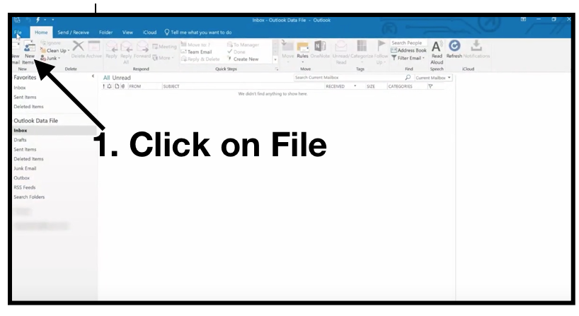
Step One: To begin, open up your Outlook email client and click on File.

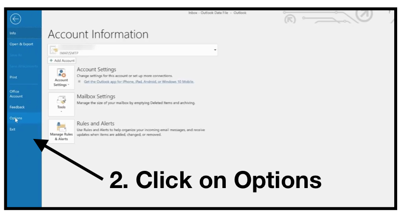
Step Two: In the file window, click on Options.

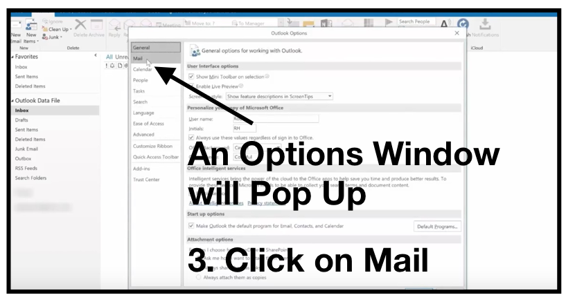
Step Three: When the Options window pops up, click on Mail.

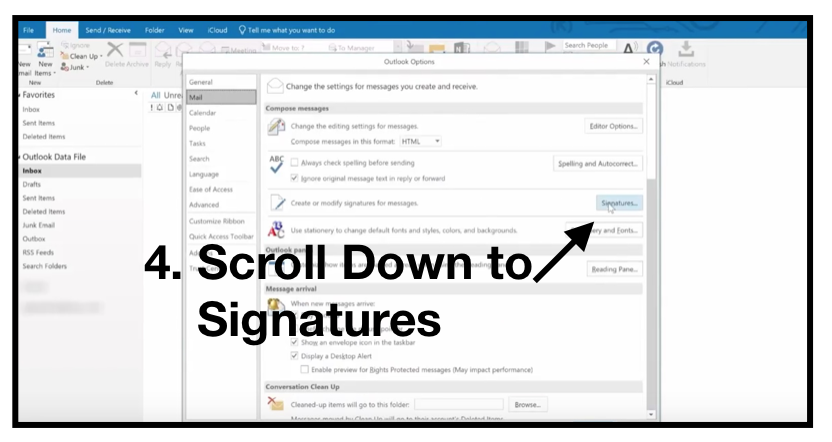
Step Four: In the Mail section, scroll down to Signatures.

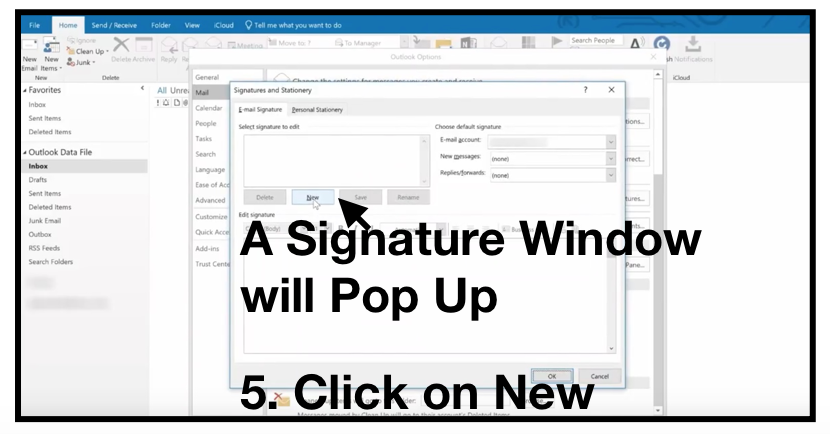
Step Five: When the Signature window opens, Click on New.

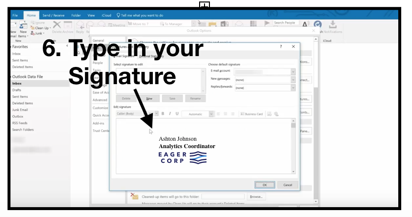
Step Six: In the Signature window, type in your signature and add a company logo if you desire.

Once you have completed this process, you can select New Email to see the signature you’ve created.

Adding an Email Signature to Outlook.com

If you are using Outlook.com instead of the desktop version of Outlook, adding a signature is a little different. Let’s look at how to add a signature to Outlook.com.

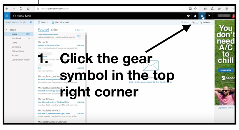
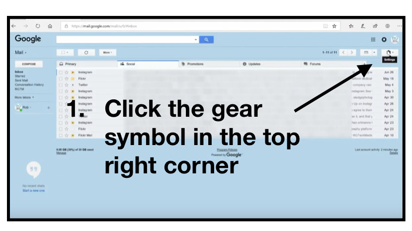
Step One: In your Outlook.com email, click the gear symbol in the top right corner.

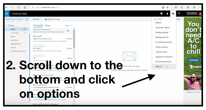
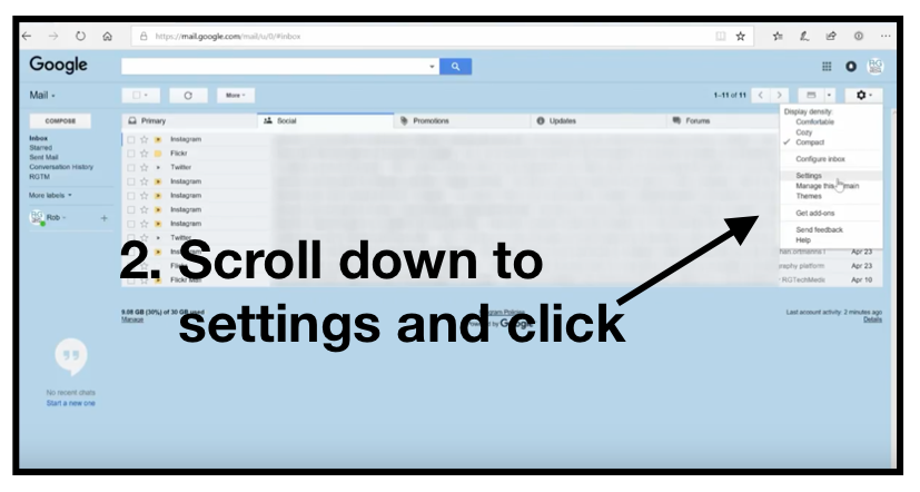
Step Two: In the dropdown, scroll down to options, and click on it.

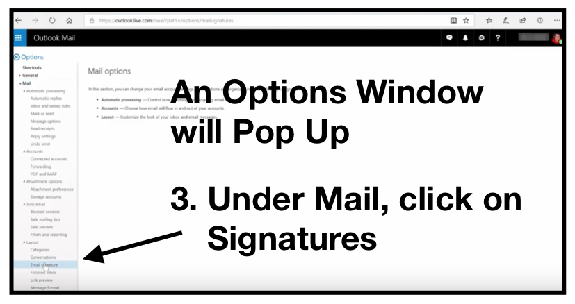
Step Three: In the Options window, scroll down to mail, and click on Signatures.

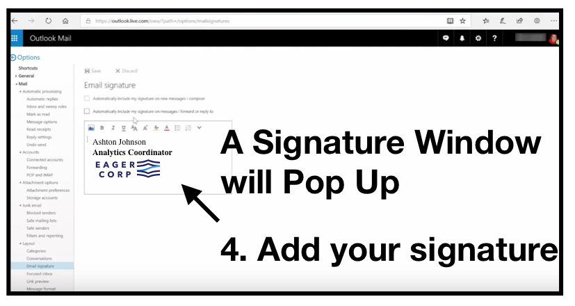
Step Four: When the Signature window appears, add your customized signature.

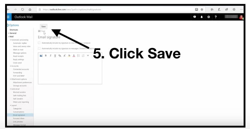
Step Five: After adding your signature, click the Save button.

Once you have completed this process, you can select New Email to see the signature you created.

Gmail

Frequently Used Keyboard Shortcuts

As with Outlook, knowing keyboard shortcuts in Gmail can quicken your tasks of sending emails. However, with Gmail, you first need to turn the keyboard shortcuts on.

Turning on Keyboard Shortcuts in Gmail

First: In your Gmail window, click the gear symbol in the top right corner.

Second: Click on Settings.

Third: Scroll down to the “Keyboard Shortcuts” section.

Fourth: Select Keyboard Shortcuts On.

Last: At the bottom of the page, click Save Changes.

Gmail Shortcuts

Once you have your keyboard shortcuts turned on, here are some great shortcuts in Gmail:

Open keyboard shortcut help: Shift + ?

Select a series of messages: Shift

Select all unread messages: Shift + 8 + u

Archive selected messages: e

Mark selected messages as important: =

Compose Email: c

Undo last action: z

Search for messages: /

Go to tasks: g + k

Add a conversation to tasks: Shift + t

Reply: r

Reply all: a

Forward: f

Mark current messages unread: Shift + u

Mark selected message as important: =

Archive selected message: e

Jump to newer email: k

Jump to previous email: j

Jump to next message in email thread: n

Jump to the previous message in email thread: p

Jump back to inbox view: u

Insert link: Command + k

Insert numbered list: Command + Shift + 7

Insert bullet points: Command + Shift + 8

Bold/Italicize/Underline: Command + b/Command + l/Command + u

Remove formatting: Command + Control + \

Send Email: Command + Enter

Adding an Email Signature to Gmail

Step One: After you have signed in to your Gmail account, click the gear symbol in the top right corner.

Step Two: In the drop down, click on Settings.

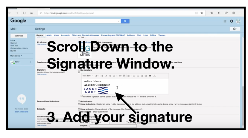
Step Three: In Settings, scroll down to the Signature window, and add your Signature.

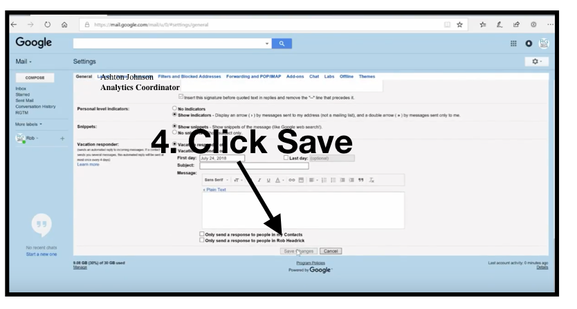
Step Four: At the bottom of the page, click Save Changes.

Wrap Up

There you have it! Easy ways to add a custom signature to today’s most popular email platforms. Plus, as a bonus, all the shortcut keys you need to make sure you’re saving time and being productive each day.