10 Easy Steps Implementing Your Successful SOP with SharePoint

Sharepoint SOPs

Standard Operating Procedures (SOPs) are necessary for every industry. The written procedures keep a company on track. The importance of having them is to guarantee the organization remains compliant with all federally mandated regulations, legislation, and ever-changing laws. But too often many businesses will continue to struggle with getting the correct and appropriate SOP created, distributed and understood by their employees.

Sharepoint SOPs

What is an SOP?

Standard Operating Procedures are clearly defined instructions. Their purpose is to, execute consistency of the performance, of a specific function. A detailed written and enacted SOP are used to fulfill compliance requirements, mitigate safety and health risk, and directly work consistently and efficiently across an entire organization. This guide provides you with ten easy steps to review when implementing your organization’s SOP.

Step 1 – SOP purpose is clearly understood and explained

Are you wondering why an SOP is required? In your organization, you want problems solved before they arise. So, what issues need addressing and what does it need to accomplish. Here are some examples:

  • Reducing costs
  • Increasing quality
  • Ensuring safety
  • Reducing risk
  • Protecting the environment
  • Providing a training source

Step 2 – Consider your audience diversity

Before your Standard Operating Procedure gets written, you’ll want to look at your intended audience. Does this audience have prior knowledge of the subject matter? Will they have the necessary language skills to understand? Also, what is the size and shape of your audience? Remember, some parts of the SOP will make sense to one group, but not another.

Step 3 – Format and layout must be useful

There are no right or wrong ways when designing or presenting your SOP, but here are some easy reminders to consider:

  • If you have a pre-existing format that is working well, then there is no need to change it, but do consider slight enhancements. Sometimes a new visual does grab the readers attention.
  • Does your process have multiple routes? That’s okay. Consider using a flowchart layout. Many individuals learn better with visual content.
  • How long is the process? Short or very long? Then use hierarchical steps. To provide clarity, give a list of main steps with sub-steps underneath that helps.
  • Is the routine simple which only requires just a few steps? Then using a simple list may be the most beneficial way.

Step 4 – Suitable authors must be used

To write an SOP; you need to have the necessary knowledge. While you may have been assigned to create, and even own this SOP, always bear in mind, you need to have the required expertise to write it. Guarantee that experts in the relevant areas get brought into the authorizing process. Using SharePoint tools to expedite that collaboration is crucial to success during this phase.

Step 5 – Supply appropriate content and structure

There will always be specific needs for unique situations. But, these examples below are necessary details that must get included in your SOP:

  • What is the scope of an SOP
  • What is the SOP procedure
  • Are there any Health and Safety Considerations
  • Are there any equipment needs
  • Glossary of terms and Hints and Tips

Step 6 – Use a writing style the reader can easily read and understand

  • All content in your document must remain clear and easy to read. Not doing so will make it hard for your reader understand any references, making comprehension difficult.
  • Avoid personal pronouns, such as He, Him, She, Her, Them, and You.
  • Establish steps that explicitly help with ease of reference and maintenance in the future.
  • Avoid walls of text. Insert diagrams, flowcharts, and bullet points.

Step 7 – Mandatory SOP testing

Your personnel must get SOP tested, especially by the people who will use it, and guarantee comments are taken on board and updated within the SOP as needed and required.

Step 8 – Make it known to your entire staff where to find the SOP

Organizations that have implemented a Standard Operating Procedure, typically have a known location where to find the material. But do not assume everyone in your organization knows where to look. It might be at a SharePoint site either department or organization level, but make sure everyone knows where to look.

Step 9 – Check that the SOP was distributed and read

While a repository is required, placing your SOP on SharePoint to be read does not go far enough. Immediately after your SOP gets updated or put in place, an email should be crafted and sent to all the relevant user groups to read the document. Then a response back from all recipients they have read and understood the material. You could use a SharePoint based tool to manage this whole process for you.

Step 10 – Guarantee staff fully understands

After each staff member has read the SOP, next comes sitting with them to make sure they clearly understand and expected of them. There is a need to guarantee your team has a clear understanding of what is meant by the Standard Operating Procedure. Testing your staff after reading the material, gives you an idea of what they do or do not comprehend, and how you can address any concerns.

Did you find this article informative? If you liked this one, check out our other content we think you’ll find interesting.

Does Power BI Make Sense For Your Business?

Business Intelligence

If you could draw insights from your data within five minutes flat, would that get your attention? Microsoft’s Power BI is an online service, with a connection to other Software-as-a-Service (SaaS) applications, that lets you analyze, visualize and transform data quickly and easily. Through the use of Power BI dashboards, interactive reports, and rich visualizations, your company will make sound decisions in less time, and with no effort.

What Are Microsoft’s Power BI Ease-of-use Features?

We believe tearing down skill level barriers is one of the most vital benefits you can get from Microsoft’s Power BI and makes sense for every business owner. At its core, Power BI is designed to be a tool for everyone.

That’s why Microsoft not only filled it with the best data analytical features available; but also made Power BI incredibly easy to use. That way, everyone at your business or organization will benefit from intelligent, data-driven analysis—regardless of their skill level.

  • Build intuitive charts and graphs in minutes

Plug in your data, select your graphics and start showing off. With Power BI, you won’t have to rely on hard-to-schedule graphic designers to make your data beautiful ever again. After connecting your data sources to Power BI, you can immediately start using the drag-and-drop menu to build stunning visualizations. Choose from the standard bar or column charts, as well as treemaps, pie charts, and even more specialized graphs such as waterfalls and gauges. You can also build custom graphics using the library of visualizations the Power BI community is continually putting online. Keep refining by removing individual elements, isolating key categories, adjusting axes, and more.

After you’ve transformed your data, you can then take your most useful charts and graphics and quickly combine them all into a custom dashboard with just a few clicks. Create several panels for managing different aspects of your organization, or use only one so you can glean insights at a glance. You can even share these dashboards with other team members, driving efficiency and high-level decision-making throughout your organization.

  • Explore your data using natural language

Finding the answers you want is as easy as asking a question. One of the most exciting features of Power BI is its ability to interpret queries and questions phrased in natural language. To start exploring through your data, ask a simple question, such as “What were the sales numbers for last quarter?” Power BI will then automatically select the corresponding data and choose the appropriate visualizations to depict it. If you’d like to dive in further, keep refining your question, until you’ve found what you need—or what you were looking for all along.

When finished, you can operationalize that custom data by including it in your dashboard or by sharing it with the rest of your organization. In this way, Power BI helps remove any potential barriers to data exploration and promotes a culture aligned with data analytics. Everyone will finally be able to uncover exactly the information they need.

  • Access data analytics wherever you are

The Power BI mobile app puts everything you need in your palm. Today’s workers aren’t just sitting in their office all day. They’re always on the go, so it’s essential they continually have access to the data analytics they need. The Power BI mobile app does more than connect with the rest of your Power BI data, so you can check it while you’re away. It offers full integration to help you focus on only the information you need.

For example, once you create a custom dashboard within Power BI, it will automatically appear in your Power BI mobile app, where you can scroll through to view it through the easy-to-use interface. You can take it another step further; tell the mobile app to notify you if any data points you’re tracking exceed a certain threshold. That way, it saves you the trouble of constantly monitoring your phone while you’re out of the office.

The Power BI mobile app also makes it easy to annotate live data and share it through text, email, or through the app itself—giving you further control over your data wherever you go.

  • Seamlessly connect all of your data

You get native integration with hundreds of data sources, apps, and services. Before you can begin sharing and collaborating with your data, you first have to make sure that everyone can access it in one place. Power BI makes this easy by automatically connecting to hundreds of different data sources, as well as many more apps and services that your organization may already use. That includes native integrations with SQL Server, Azure, SAP Hana, Office 365, Microsoft Dynamics, Adobe Analytics, Salesforce, and much more. New combinations are continually being developed as well, helping to extend further, Power BI’s reach.

With this level of flexibility, you can finally create a convenient way for your entire organization to view all its data under one umbrella. For example, after connecting your CRM system and website analytics software to Power BI, you could create a graph directly comparing website visitors with your sales. Dive further, and you could even correlate the average time a visitor spends on your website before making a purchase.

Once you open up this capability to your entire organization, the possibilities of new and valuable insights are endless. Which you’ll agree, Microsoft’s Power BI does make sense for your business.

Business Intelligence

Did you find this article informative? If you liked this one, check out our other content we think you’ll find interesting.
What Are The New Changes in Microsoft Outlook?

https://i1.wp.com/www.archynety.com/wp-content/uploads/2018/09/Outlook-Microsoft-starts-with-the-implementation-of-its-simplified-custom-ribbon.png?w=770&ssl=1

New Calendar, Mail, and mobile Outlook features help you get things done, was the title of the April 30th, 2018 blog from Microsoft’s Outlook team, about the newest features. Since then, Outlook has received more modern additions, from mobile management to enterprise information protection all designed for user simplicity. So, let’s step inside and see what new changes Microsoft Outlook has.

What’s New Inside Outlook Calendar?

With the familiarity of Outlook and making it easier to get things done, and customizable, so you stay in control, it couldn’t be any simpler than Bill Pay Reminders. That’s correct, inside Calendar you can automatically track these events.

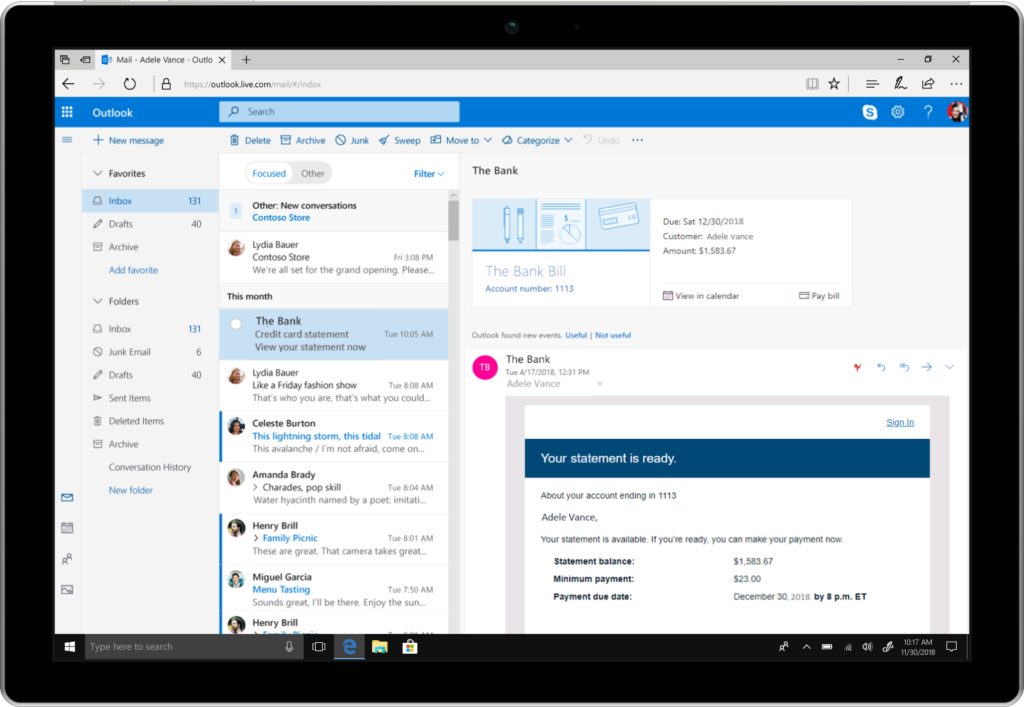
At the top of your email, you’ll get a summary card (See Fig 1.), just like you do when your package delivery information or any travel reservations is presented in Outlook at the top in your Email Today.

https://www.microsoft.com/en-us/microsoft-365/blog/wp-content/uploads/sites/2/2018/04/000000_OutlookOnline_BillPay_surface_m2-1024x707.png

Fig 1. Summary Card inside Microsoft Outlook

Outlook will identify the bills you receive in your email. At the top, it will show you a summary, and automatically add a calendar event on the due date. Two days before the due date, you’ll receive an email reminder so you won’t forget to pay your bills on time.

Suggested meeting rooms and event locations—Adding a meeting or event location just got faster and easier inside Outlook. Similar to a virtual assistant Outlook will offer suggestions for your meeting location. Just start typing in the location field. Based on Bing, Outlook suggests options and then autocompletes your meeting location with the information you’ll need.

Outlook’s rich location feature adds the full address for public locations into your calendar event. Based on your current location, your destination address, and traffic updates a notification is sent when it is time to leave.

Also reserving a meeting room, from your mobile device continues getting more accessible and faster as Outlook learns your preferences. Let’s say you must find a conference room. Outlook will show you what your organization’s room availability is so that you can choose what option is best for your meeting, and it’s all done with just a tap.

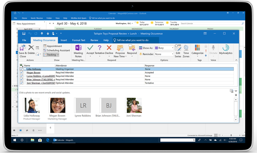
Meeting RSVP tracking and forwarding—The key to time management is keeping track of events you’ve plan to attend, or organized. However, managing who is participating is more useful to you also. Inside Outlook, you can now see all tracked meeting responses and RSVPs. (See Fig 2.)

https://www.microsoft.com/en-us/microsoft-365/blog/wp-content/uploads/sites/2/2018/04/Image-2-Outlook_Calendar-RSVP-Tracking_Tablet_m2-1024x609.png

Fig 2. Person’s Name, who are attending, and their responses are shown for easy tracking.

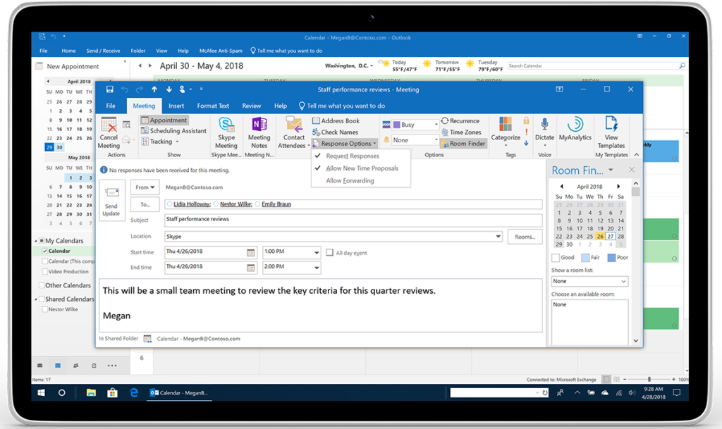
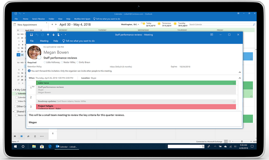
But let’s say you have to plan a meeting, and you are required to keep complete control of the attendees on the list. Inside Outlook, you have a new option to prevent or allow your calendar invitation from being forwarded without your knowledge. Under Response Options, click New Meeting and then check or uncheck Allow Forwarding. (See Fig 3.)

https://www.microsoft.com/en-us/microsoft-365/blog/wp-content/uploads/sites/2/2018/04/Image-3-_Outlook_Calendar-No-forwarding-Megan_Tablet_m1-1024x609.png

Fig 3. The Response Options’ drop-down menu shows where to check or uncheck.

https://www.microsoft.com/en-us/microsoft-365/blog/wp-content/uploads/sites/2/2018/04/Image-4-Outlook_Calendar-No-forwarding-Lidia_Tablet_m1-1024x609.png

Fig 4. Below recipient’s photo is a message alerting them, they cannot forward this invitation.

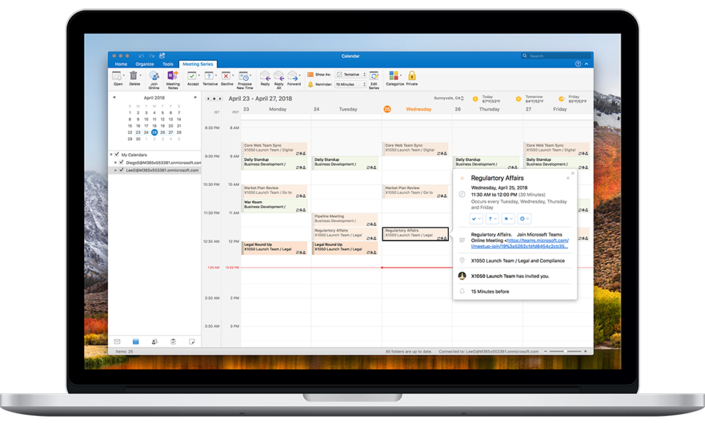
Multiple time zones—Managing events, inside Outlook, across various times zones, is no longer complicated. Go ahead and define the start and end times, across all time zones, for your meetings and appointments. Set up that travel event from the departing time zone to when you arrive at your final destination, in another time zone. (See Fig 5.)

https://www.microsoft.com/en-us/microsoft-365/blog/wp-content/uploads/sites/2/2018/04/Image-5-Outlook_DualTimeZone_Macbook-Pro-15_m1-1024x614.png

Fig 5. On the main calendar grid, you can display multiple time zones in Outlook.

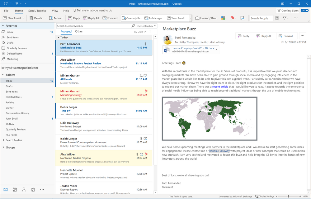
Simplified Ribbon— is adaptable and easily customizable. That single row of commands you rely on can be quickly and easily personalized. You can either pin the controls or remove them from the ribbon anytime. Should you want to go back to the classic, full-ribbon, just click back anytime. (See Fig 6.)

  • Simplified Ribbon is adaptive
  • Adjusts icon labels
  • Moves commands out of the way
  • Scales up or down to fit different window sizes
  • Accessible through new ellipses and menu drop down experiences.

https://gxcuf89792.i.lithium.com/t5/image/serverpage/image-id/44743i5D498FE0B9BA6688/image-size/large?v=1.0&px=999

Fig 6. Ribbon shows customized commands.

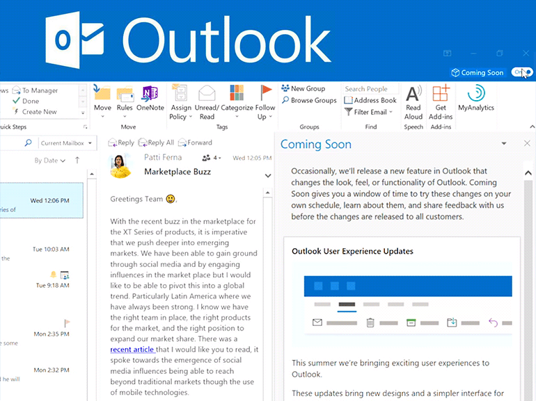
“Coming Soon”— in Outlook for Windows, the Outlook team introduced a new feature called “Coming soon.” Coming Soon is about making it easier for all users, to discover and learn more about significant updates. With this feature, you just turn it on or off. When it’s on, you can see upcoming visuals that are coming to Outlook. Your overall core experience is now cleaner, simpler and more modern. (See Fig 7.)

https://i1.wp.com/www.archynety.com/wp-content/uploads/2018/09/Outlook-Microsoft-starts-with-the-implementation-of-its-simplified-custom-ribbon.png?w=770&ssl=1

The updated Outlook for Windows experience is more straightforward and more customizable. You will work faster and get back to the things that matter most, your free time and user experience. Outlook helps you connect, organize and get things done.

[1] New Calendar, Mail, and mobile Outlook features help you get things done

[2] Your favorite email app, Outlook mobile, adds new enterprise information protection and mobile management capabilities

Did you find this article informative? If you liked this one, check out our other content we think you’ll find interesting.
 

Apple iOS 12: Top Features You Need to Know About

ios12 features

Apple iOS 12 has so many different new features available it’s almost overwhelming. From better password management options to the introduction of the Memoji, users will appreciate some of these more than others. This article will highlight some of the most interesting and useful features and improvements, starting with one everyone can agree is probably overdue: better performance and battery life.

Performance and Battery Life

With iOS 12, all iPhone models since the 5S will see significant improvements in performance – including longer battery life and speed boosts. This is due to several improvements and changes that, combined, enable your phone to last longer and run faster. You can also access much more detailed information on your battery life and performance, even comparing its current performance to what it was capable of when it was brand new.

Password Management Methods

Apple’s iOS 12 allows you to use third-party password management apps instead of, or in addition to, its own password management method (iCloud keychain). This also includes autofill support for these third-party password managers. In addition, iOS 12 will fill in any six-digit codes you receive through SMS for two-factor authentication. To better support online security and privacy, iOS 12 will remind you if you are reusing a password when setting up a new password. It can also create a very powerful password for you and store it on your iCloud keychain.

Secure Emergency Location Data

Another awesome feature in iOS 12 is that it will provide secure location data to first responders if you call 911. This feature makes use of a new Apple technology called HELO that can estimate your location based on a variety of parameters, including GPS, Wi-Fi access points, and cell towers. This will make it much easier for iPhone users to be quickly located by first responders in case of an emergency.

More Emojis, Animojis, and Memojis

For those of you who love to express yourself with emojis, good news: 70 new emojis are being added. And not only that, but Apple is working on more inclusive disability-themed emojis that will be released next year. To access all these new emojis, you’ll need to update to iOS 12.1 when it is released. Apple has also added more Animojis in iOS 12. Now you can access a T. rex, tiger, ghost, and koala, in addition to those that were already available. For those not content with Animojis, Apple has introduced Memojis. These are basically augmented reality characters that you can customize to look like you.

Better Maps

With iOS 12, the Maps app has been redesigned to provide more detail. This includes more public landmarks, more greenery, and the ability to see the layout of stores in malls. Currently, this only applies to the San Francisco Bay region, but it will be added to maps for the entire United States over the next year and a half.

Group Facetime

Group Facetime, now integrated into iMessage, will allow you to simultaneously FaceTime chat with up to 32 people. These calls are very easy to set up via the group chat window in iMessage, and are available through the iPad, iPhone, and the Mac.

Screen Time Report

Have you ever wondered exactly how much time you spend on your Apple devices? Or what apps you really use the most? Well, iOS 12 has added a weekly activity summary that provides plenty of detail. The new App Limits feature does just what it says: it will provide you notifications reminding you of when you are nearing or have reached any limits you set. And for those with children or teenagers, the Downtime feature allows you to control their usage, setting specific limits for apps or even unplug their access completely.

Greatly Improved QR Reader

iOS 12 users will have a much easier time reading QR codes. In the past, a stand-alone app was needed to read QR codes. Now, once you turn on the QR code feature in the settings for your camera, you’ll be able to read QR codes using your Camera app. iOS 12 will highlight the code for you so you will know it has been detected, and you can add a tile to more easily launch QR reader capabilities.

New Developments for Notifications

On iOS 12, you can now decide which apps will deliver silent notifications to your phone (e.g., no sounds, no vibrations), and Siri can advise you on which apps you don’t use often and thus should turn off notifications for. Notifications can also be grouped by app, topic, and even thread. You can also enact a Do Not Disturb feature that will hide your notifications until you turn it off, and you can set it up to automatically turn off when a certain event ends or at a particular time.

Conclusion

No matter how much you use Apple devices, you’ll find some features and improvements in iOS 12 that will make your user experience much more productive and fun. And remember that this was just a sampling of what is now available! There’s a lot more so be sure and check it out.

What You Need to Know About Secure Messaging Apps

Secure Messaging Applications

You probably use messaging for communications every day, but how secure are your messages? Messaging apps are as susceptible to hackers as any other type of electronic communication, and if you are concerned about privacy then it’s time to learn the basics about secure messaging apps.

Secure Messaging Applications

Why You Need a Secure Messaging App

We use messaging more and more to communicate, but we don’t always realize how many eavesdroppers there may be. Those eavesdroppers may include internet service providers, government agencies, and hackers. If your messaging involves your company, it might be the target of industrial espionage. These are all good reasons to consider using a secure messaging app.

What Makes a Messaging App Secure?

We probably all remember playing around with coded messages as a kid, but never dreamed that coded messages might become important in our day-to-day communications. As it turns out, one of the key aspects of a messaging app is end-to-end encryption.

When your messages are encrypted, that means they are encoded in such a way as to make it extremely difficult for someone to eavesdrop on the information being transferred. The messages are basically scrambled, and in order to unscramble them, you must have the correct key. In the case of an end-to-end encrypted message app, only the sender and the receiver have the decryption keys.

There are messaging apps that offer encryption, but encryption is not the default setting. That means that you would have to navigate to the settings for your messaging app and turn on encryption – if it even offers that feature.

Metadata can still be an issue even with encryption. Metadata includes things like who you talk to based on your contact list, how much time you spend talking to them, your phone number, your IP address, and more. You should avoid messaging apps that collect metadata.

Believe it or not, one of the signs of a secure messaging app’s integrity is making its source code available to the public. Open source code is actually better than proprietary code because it provides experts access to the code for review. Experts who did not develop the code will be far more likely to notice vulnerabilities and bugs that could be exploited. The result is a highly robust source code and a bulletproof app.

Secure Message Apps

There are several messaging apps on the market that qualify as secure messaging apps. What follows are five of the top options that are available for Android and iOS operating systems.

Dust: If you want messages that don’t hang around, then Dust is your app! Messages disappear within 100 seconds of being read or within 24 hours – your choice. You’ll also be notified if any screenshots are taken. It includes end-to-end encryption, no permanent storage, and you can even erase your message off someone else’s phone. The major drawback of Dust is that its source code has never been released.

Signal: The Signal messaging platform uses end-to-end encryption and its source code has been released. There is an option that makes messages disappear after a certain amount of time has passed and it can be password protected. It only stores the metadata it needs to function properly on your device. As far as drawbacks go, there are virtually none associated with Signal.

Telegram: The Telegram app was banned in Russia because they refused to hand over the encryption keys. It offers end-to-end encryption through a feature called “Secret Chat” that must be turned on. It can be locked by a passcode and has a Self-Destruct timer option for Secret Chat messages. The drawback of Telegram is that it lacks transparency about the protocol that it uses.

WhatsApp: With WhatsApp, end-to-end encryption is the default and provides an option for you to verify that encryption is in place. Messages are not stored on your phone, and it makes available a two-step verification feature. WhatsApp’s major drawback is that it does keep track of metadata and backups of messages are not encrypted for Android users.

Wickr : Unlike most messaging apps, Wickr offers both a personal (Wickr Me) and an enterprise edition. It provides end-to-end encryption and a host of additional features that make it one of the best options for businesses that are looking to keep their messages secure. It recently released its cryptographic protocol. And when Wickr deletes things, it “shreds” them so that they cannot be recovered. Wickr doesn’t really have any drawbacks from a security perspective.

Conclusion

Not all secure messaging apps are equally as effective. When selecting one, you should look for end-to-end encryption (and by default is even better) and the storage of little to no metadata. Also, keep in mind that companies that have released the source code behind their app are considered more reliable and their apps more robust. If privacy is important to you, then it’s time to check out secure messaging apps.

Before installing or investing in any messaging app…always consult with your technical support provider.

5 Important Features You’ll Find In iOS12

ios 12 update

Apple’s newest software update has arrived, and it’s already making an impact in how effectively users manage their smartphones. iOS 12, which comes preinstalled in the iPhone XS and iPhone XS Max, is equipped with a number of shiny, new features sure to delight iPhone and iPad users, old and new models alike. From stronger battery performance to significant upgrades to maps, notifications and passwords, iOS 12 is robust in its delivery. Here, we’ll explore some of iOS12’s most anticipated new features, and how they can help you achieve more with your iPhone or iPad.

Battery Performance And Battery Life

Mobile phones are designed to help users achieve everyday tasks with ease. However, with this great power comes a need for great battery life. Luckily, iOS12 delivers on this front. The new update offers significant upgrades in both battery life and performance, helping you operate your device for longer and with more speed than ever before. What’s more, owners of older model iPhones are reaping the biggest benefits. In terms of the newest update, the older your iPhone model, the better. According to Apple, older models can expect to see speed boosts of up to 70% faster.

Earlier versions of iOS allowed users to see how much battery their favorite apps were using, and for how long. In efforts to help users further understand the extent of their usage, iOS 12 offers users charts that display battery use in great detail. The charts are broken down by Screen On usage and Screen Off Usage. Also, now users are able to see how fast their battery was depleted, as well as how these levels were during any part of the previous 24 hours. There is also a long-term overview to help users evaluate their usage over time.

Instant Tuning

An onslaught of notifications can be annoying and distracting. The new software update seeks to remedy the inconvenience of too many notifications. Now, ioS offers instant tuning, which means users can now edit notification settings on the notification itself. They can even set specific apps to deliver notifications silently, meaning they’ll show up on the display, but without vibrations or sound alerts.

Some other changes to notifications? The Do Not Disturb feature on your phone just got a whole lot more effective, allowing you to further manage the time frames in which you do not want disruptions. You can set your phone on Do Not Disturb for a certain time frame, for a certain location, or pretty much whatever time you choose.

Grouped Notifications

A common complaint among iPhone users is the barrage of notifications they receive on their screen after they’ve been inactive. Instead of receiving one notification for text messages, they were forced to scroll through endless notifications, which made it hard to easily locate priority alerts. Now, with grouped notifications, users will instead see one notification for each app, leaving more room for prioritizing tasks.

Redesigned Maps App

The modern day smartphone user relies heavily on map apps to help them reach their destinations. Glitches in the map apps are highly inconvenient for users, and the new iOS update helps to alleviate this. Other improvements include more detail like foliage, buildings, pools, pedestrian pathways and the ability to see into buildings. Currently, this feature is only available in certain areas, such as the city of San Francisco. The upgrades are expected to be available in a growing number of cities over the next year. You’ll also find improvements to traffic, construction notifications, and real-time road conditions — all intended to make your driving experience more safe and efficient.

Improved Password Management

Given the outstanding popularity of smartphones and their capabilities to manage so many aspects of everyday life, security is always a concern. While Apple devices have typically operated with their own password systems, now users are able to access their own much more easily. The latest iOS update offers an AutoFill setting that allows your chosen password manager to be available everywhere. This means password managers like OnePass and Dashlane are fair game.

Improved QR Code Reader

QR codes haven’t quite caught on for iPhone and iPad users. This may be because of several reasons. One reason may be that, prior to iOS12, scanning QR codes required a special app, making it sometimes difficult to quickly capture QR codes in passing. The newest software update comes equipped with a QR scanning shortcut that can be accessed through iPhone’s lock screen. You can do this by adding a new widget to your device’s Control Center.

ios 12 update

Smartphones, in their bid to deliver everything users hope for in a device and more, require sporadic updates to run at their optimal performance. iOS12 is just the latest to bring a new range of benefits to iPhone and iPad users everywhere. No telling what the future holds.

Using OneNote on a Tablet: Surface Pro vs the iPad Pro

Ipad Pro vs. Microsoft Surface

OneNote is a free application from Microsoft that allows you to collect notes in a variety of formats – handwritten text, typed text, digital drawings, photographs, links, screenshots, videos, and audio files – and organize them, share them, and use them to create other documents. OneNote is an excellent app whether you take notes in a classroom, convention hall, or business meeting. However, the usefulness of OneNote is greatly increased when you use a tablet with it. The two top competitors on the market today are the Surface Pro and the iPad Pro, and both are compatible with OneNote.

OneNote on a Surface Pro

Because the Microsoft Surface Pro is a Windows device, there are many more apps available that are compatible with OneNote. It works like a Windows PC, which means you can run the basic OneNote App available in the Microsoft Store. This is also true for the Surface Pro.

One of the benefits of the app is the ability to easily add pictures to your notes using the Surface Pro’s camera. Just keep in mind that the photo quality may not be very good, especially in conditions with little light. The iPad Pro offers a much better picture-taking (and editing) experience compared to the Surface Pro.

On a Surface Pro, the typical battery life is about 7 hours, which could leave someone looking for an outlet near the end of the workday even if they charged it the night before. However, the battery life is considered an improvement over the previous versions of the Surface tablet.

One of the key benefits of the Surface Pro is its physical, tactile keyboard a part of the cover. The Surface Pro does need to be docked in order to use the keyboard, but it is an option that isn’t available with an iPad Pro. Note that the keyboard can be tilted at a slight angle when used. These features would be very important to someone who plans to type their notes into OneNote rather than write them.

The ability to lay the Surface Pro screen almost flat while it is still attached to the keyboard works extremely well for adding handwritten notations to something you are working on in OneNote. Of course, the screen can be completely detached from the keyboard when needed.

Note that one of the commands available on the Surface Pro tablet that isn’t available on the iPad Pro is the Add/Remove Space command located on the Insert tab. This makes the process of rearranging the content in your notes very easy.

OneNote on an iPad Pro

Compared to the Surface Pro, the iPad Pro is both lighter and thinner, making it easier to carry around, more mobile, and easier to hold for notetaking. This can be a major benefit for those who have to spend extended time taking notes without the convenience of a desk or table. The battery life of an iPad Pro averages about 15 hours, almost twice that of the Surface Pro. This is great for users who often struggle to find an outlet to charge their device.

One of the outstanding features of the iPad Pro is the Apple Pencil. The Apple Pencil glides very smoothly and is better at capturing handwriting when compared to the Microsoft Surface Stylus, which is a great bonus for OneNote users that depend on handwritten notes. It also has a solid tip, unlike the soft tip of the Surface Stylus. The size of the tip is also slightly larger on the Pencil.

Another plus of the Apple Pencil is that you don’t have to switch tabs to erase something. Rather, you can simply flip the Pencil over and use its eraser. The lasso tool can also be turned on instantly by using the magnetic button on the Pencil.

Unlike the Surface Pro, the iPad Pro allows you to take very high-quality photos even in low-light conditions. You can then easily add them to your OneNote document, as well as zoom, crop, and focus them. This is very useful for capturing content-heavy slides during a presentation or extensive notes someone has written on a whiteboard. Also remember that the Add/Remove Space command is not available for the iPad Pro, and this can make it difficult to rearrange content you have added to your notes.

Ipad Pro vs. Microsoft Surface

Conclusion

Both the Surface Pro and the iPad Pro work extremely well with the OneNote app, but only the Surface Pro can be used with the full-fledged desktop version of OneNote (aka, OneNote 2016). The Surface Pro offers the Add/Remove space command, a tactile keyboard, and the ability to easily switch between typing in notes and writing notes. The iPad Pro, on the other hand, offers a much better writing experience when the Apple Pencil is used and the Pencil offers more functionality for things like erasing text and lassoing content. Both tablets, however, are ideal for notetaking.

The New Windows 10 Release and the Features It Will Be Dropping

Windows 10 Features Dropped

Microsoft makes it clear that with each fresh release of Windows 10 there will be new features added – and some features that will be dropped. Here is what you need to know about the features that Microsoft is dropping or stopping development for, and what the alternatives are, for the October 2018 release.

Windows 10 Features Dropped

The Difference Between Being Dropped and Stopping Development

The Windows 10, version 1809 release is coming out in October, and with it will come some very interesting changes. As we have come to expect from Microsoft, some features will be dropped altogether, some will be dropped and replaced, and some will no longer be developed. Dropped features will not be available under the new Windows release, having been replaced with something better or simply removed because they are not used anymore. When a feature is no longer going to be developed, there is a strong probability that it will be dropped in later releases. For the time being, however, it means that the feature is not going to be further developed by the Microsoft team.

Business Scanning Dropped

Business Scanning, also known as Distributed Scan Management (or DSM), is a secure scanning management feature for organizations that have many different users. It is being dropped for the simple reason that there are no longer any devices that support it and thus it is no longer needed.

Disk Cleanup Tool Dropped

The Disk Cleanup Tool has essentially been replaced by Storage Sense in Windows 10 and is being deprecated in this release. Storage Sense will both monitor and automatically free up space on your hard drive.

Hologram App Dropped and Replaced

The Hologram App is being dropped but will be replaced with functionality within the Mixed Reality Viewer. For those that still need to create 3D word art, Microsoft recommends using Paint 3D and viewing the resulting work using Hololens with the Mixed Reality Viewer or in VR.

FontSmoothing Setting in unattend.xml Dropped

The purpose of the FontSmoothing setting was to allow selection of the antialiasing strategy to be used across the system. Windows 10 now uses ClearType by default, so this setting is no longer needed. If it appears in an unattend.xml file, it will simply be ignored. Dropping this particular feature should cause no foreseeable problems for users.

Limpet.exe Dropped and Replaced with Open Source

The limpet.exe is a tool used to access the Trusted Platform Module (TPM) for Azure connectivity. Microsoft has decided to release limpet.exe as open source.

The Phone Companion App Dropped

One of the features that users can expect to see dropped is the Microsoft Phone Companion App. This useful app acted as a basic guide on how to get Microsoft services on your phone. This included things such as synching your media files and documents, installing apps, or using Cortana.

Microsoft has said that new replacement apps are in development, one for iPhones and one for Android phones. In the meantime, Microsoft recommends using the Phone page available under Settings to accomplish the same thing.

Updates Through the WEDU Server

Microsoft will no longer publish new updates to the Windows Embedded Developer Update (WEDU) server for Windows Embedded 8 Standard and Windows Embedded Standard 8. Updates should be downloaded from the Microsoft Update Catalog.

Trusted Platform Module Management Console Moved

The information that used to be found in the Trusted Platform Module (TPM) Management Console has been moved. The same information is still available, but now under the Windows Defender Security Center on the Device Security page.

Companion Device Dynamic Lock APIs Development Ends

In Windows 10, version 1709, Microsoft introduced Dynamic Lock as a part of the companion device framework (CDF) APIs. It would lock or unlock a PC based on whether Bluetooth could detect a user present. This particular CDF method was not adopted by third-party partners and therefore it is no longer going to be developed.

OneSync Service Development Ends

Another app whose development is coming to an end is the OneSync service Calendar, Mail, and People apps. Microsoft has now added a sync engine directly to the Outlook app that makes OneSync unnecessary.

Snipping Tool Development Ends

While the Snipping Tool isn’t being dropped from the new release, Microsoft has announced that it will no longer be actively developed. A new tool called Snip & Sketch (formerly known as Screen Sketch) is being introduced in this release. The functionality of the Snipping Tool will be consolidated with Snip & Sketch, which means even more functionality.

Conclusion

The new Microsoft Windows 10 Release that is coming out in October includes quite a few changes. Fortunately, most of the tools and apps that are being dropped are either no longer in use or have a solid replacement waiting in the wings. The same can be said for the services, tools, and APIs whose development has ended.


Tech Tip: iPad Pro vs. Microsoft Surface Pro

Ipad Pro vs. Microsoft Surface

Laptop users are loyal to their devices, but when portability is a priority, tablets can’t be beaten.

With so many strong tablet contenders on the market, narrowing down the options before making a purchase can seem overwhelming. This is especially true for shoppers who aren’t quite sure what features they’ll find most useful in a tablet. While there are dozens of capable models to choose from, there are two that stand out from the rest: the Apple iPad Pro and its worthy opponent, the Microsoft Surface Pro.

Apple’s iPad Pro and the Surface Pro have garnered their share of loyal users over recent years, and it’s easy to see why. Each boasts their own unique power and performance capabilities, but there are still plenty of differences between these two tablets.

Here are a few ways to distinguish which option of these two will work best for you.

Appearance

Apple has made big strides with the iPad Pro’s design. It manages to pack a 10.5-inch screen into a frame not much larger than the 9.7-inch Pro.

The Surface Pro takes this even further with a 12.3-inch display, though this is not without its caveats. The Surface Pro, with its larger screen, also weighs more than its iPad counterpart. The iPad Pro is slimmer than the Surface Pro, too, measuring just 0.24 inches thick.

Today’s tablet users aren’t settling for lackluster screen quality. Brilliant picture is preferred, and both contenders deliver this, though slightly differently. Apple’s 10.5 iPad Pro is packing a crisp, 2224 x 1668-pixel display, compared to the Surface Pro’s 2736 x 1824-pixel panel, which offers higher resolution.

Operating Systems

Operating systems, unsurprisingly, carry plenty of weight in the realm of tablets. The Surface Pro boasts a reliable, highly functional OS in Windows 10 Pro. With it comes a long list of benefits, including access to full versions of Win32 software, plus Flash, Java, apps and more.

Apple’s iOS is lacking in some areas Windows 10 is strong in, but not all hope is lost. The iPad’s got a new A10X Fusion chip intended to tackle a variety of intensive tasks, like 4K video editing and complex data spreadsheets. And with millions of apps to choose from on the Apple App store, you can be sure that security is top-notch. Apps on the App store require approval before becoming available to the masses, meaning picking up some malware as you download seems unlikely. Though, to be fair, Windows is striving for this same level of security, and may just replicate it with the newest Windows 10 S operating system.

Given that a tablets’ biggest strength lies in portability, battery life is of great importance to users, as it should be. The iPad, in many ways, sets the standard for battery life in tablets. In the showdown between the iPad and the Surface Pro, there is a big difference in battery life that shouldn’t be ignored. When put to the test, the iPad Pro allowed for 15 hours and 38 minutes of video streaming, while the Surface Pro tapped out at 8 hours and 25 minutes.

Multi-Tasking Capabilities

The ability to multi-task is another strong feature when it comes to tablets. A device with the power to do all you want it to, and then some, will ensure you get the most bang for your buck. In regard to workflow, you may find that iOS can’t handle all the tasks that Windows can. The iPad Pro has gotten a few upgrades, including the ability to drag and drop text, images and other files back and forth between apps. You’ll also find a customizable Dock ideal for easily accessing your most frequently used apps.

Windows’ updated capabilities include Timeline, a tool that allows users to jump back to a website, app or another file across platforms. Another app, named Windows Story Remix, can mix videos and photos with 3D objects to create unique themed videos.

Connectivity

Connectivity is an important factor to consider when shopping for laptops. The iPad Pro doesn’t offer much in terms of ports. It’s outfitted only with a lightning port, smart keyboard connector and headphone jack. This means you’ll need to purchase adapters and other add-ons to connect to external displays. The Surface Pro, on the other hand, contains a USB 3.0 port, a Mini DisplayPort, microSD card reader, Surface Connect port and Type Cover port. This renders the Surface Pro the clear winner in the battle for better connectivity.

Accessories

If you’re hoping to make the most of your tablet, you’d do well to pick up the right accessories. For the Surface Pro, this means Microsoft’s Type Cover, which is comparable to Apple’s Smart Keyboard. While both options will make for an easy typing experience, the Surface Pro has the advantage with its built-in hinge, which offers better positioning, as well as its built-in trackpad.

Both devices carry the option of a separately purchased stylus, and while the iPad’s $99 Pencil may navigate the screen more easily, the Surface’s pen has its own perks. It offers the option of different tips, so you can change them to suit your needs. Plus, it runs on an AAAA battery that can last up to a year. It also comes equipped with an eraser on top, as well as a programmable button.

Ipad Pro vs. Microsoft Surface

If you’re hoping for a truly worthwhile tablet experience, you must do your due diligence. This means examining the many ways in which these two tablet heavy-hitters differ, and how each can impact your experience based on what you hope to use your tablet for.

3 Quick Tips To Boost Your LinkedIn Skills

LinkedIn Tips

Are You Using Your LinkedIn Profile To Its Full Potential?

LinkedIn is, as I’m sure you’re well aware, a hugely popular social media platform for professionals in a wide range of industries. The site allows for fantastic networking opportunities and gives you a place to get yourself, your business, and your skills out there for potential clients, partners, or employers to find.

By following these three easy tips, you can get even more out of the platform by improving your overall skills with LinkedIn.

Tip 1 – Change How Your Profile Is Viewed

Not everything in your LinkedIn profile needs to be visible to everyone who visits your page. Much like the privacy controls on Facebook, you can easily change how your networking and profile information is viewed. Start by clicking on the ‘Me’ icon at the top of the page, then select ‘Settings and Privacy.’ Click on the privacy tab and you’ll see more than half a dozen options for changing who can see what information about you. You’ll also see other privacy-related settings that are customizable. Take a moment to go through these settings and adjust them to suit your preferences.

Tip 2 – View Your Post Statistics

Sharing content to your page is a common use of the LinkedIn platform. If you’ve ever posted an article or video to LinkedIn, you can see specific demographics about your readers or viewers that can give you a better idea of who you’re reaching. To view these stats, click on ‘Me,’ then select ‘View Profile’ and scroll down the page until you see the ‘My Dashboard’ section. Click on ‘Post Views’ and then click the ‘Posts’ tab.

On this page, scroll down to the post you want to view the stats for and you’ll see the view count displayed in the lower left corner of the entry next to a small graph icon. Click on the text next to the graph and the stats of your readers or viewers will be displayed, broken down into company, title, and location. At a glance, you can see who your primary audience is made up of. This is a great way to find out if the content you’re sharing is attracting the demographics you were hoping to reach.

Tip 3 – Use Boolean Search Terms

LinkedIn allows for the use of Boolean search parameters, giving you the ability to filter your searches more specifically to find exactly what you’re looking for. You can do this by adding or eliminating elements from the search parameters. Let’s say for example you wanted to find someone who is an expert in presentation design. If you use that as a key term in your search, your search results would show anyone who had the words presentation and design in their profile, even if the two words were located separately on their page. By adding quotes around “presentation design,” your search results would only list those that had the two words together. Quotations only need to be used when using multiple word-search terms.

Another example could be if you wanted to find someone that has expertise in both infographics and presentation design. This time, you would type in infographics AND presentation design. By adding the AND qualifier, you group those two terms together ensuring that you see more relevant results.

Some other Boolean search parameters you can use for more targeted searches include the qualifier OR, which separates one or more search terms such as “Vice President” OR VP OR “V.P.” OR SVP OR EVP.

Parenthetical searches allow for more complex searches by combining terms and qualifiers using parentheses, such as design AND (graphic OR presentation) or (copyediting OR “copy editor”). The NOT qualifier allows you to do a search that excludes specific parameters, for example, VP NOT director or the more complex (Google OR Salesforce) NOT LinkedIn. A few small tweaks to the way you conduct searches can give you much better results in much less time.

LinkedIn Tips

Your LinkedIn profile is a powerful professional tool when wielded properly. There is a lot more you can learn just by exploring both your page and the site itself that can help you do even more with your account, but mastering the basics and learning a few cool tricks is a great way to start.

Ready to learn even more about how you can use this networking and social media platform in new and exciting ways?